CaseArchitecture · Visual identity
Cotidiana
An identity made of verbs.
Visual identity for a cooperative of women architects in Seville. The letters of the name rain down, blow away, simmer, spin and fall back into place.
- Project
- Cotidiana
- Field
- Architecture · Cooperative · Seville
- Type of brief
- New identity
- Work by ANTES.
- Branding
Visual identity
Logo design
Animated logo
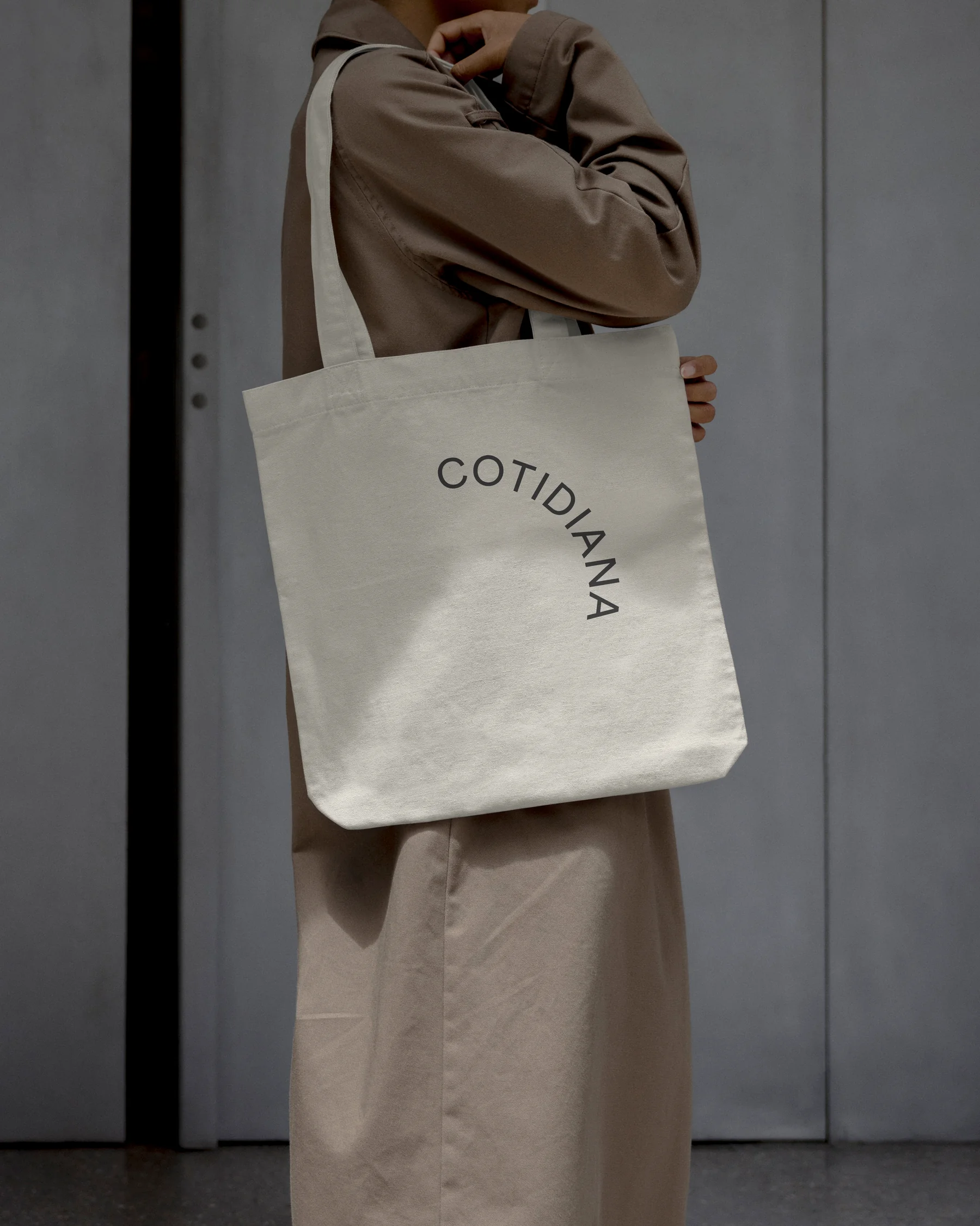
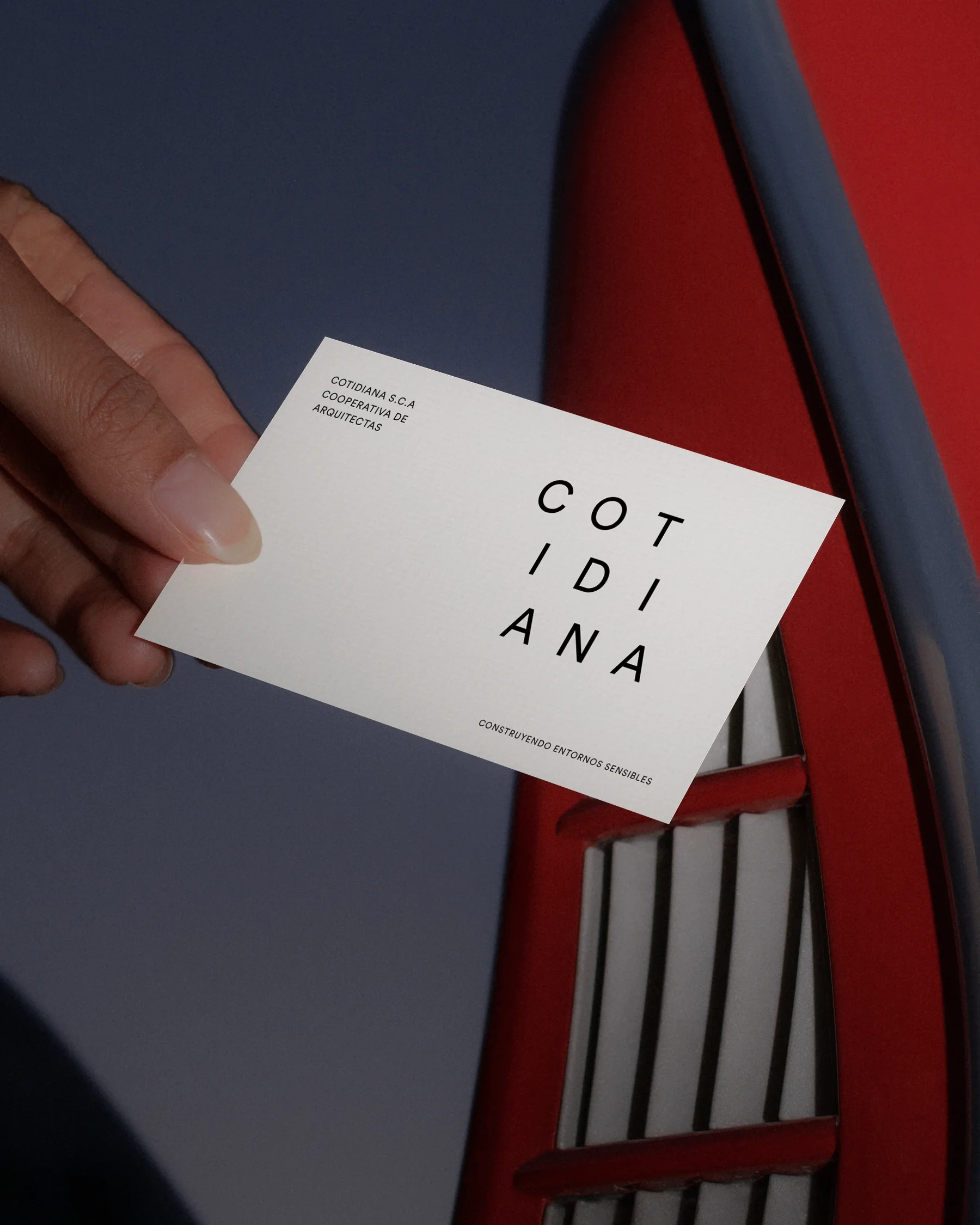
Stationery
Web design
A cooperative of women architects who approach architecture from close by, with people taking part in what happens every day in their homes and streets. They asked us for an identity that captured that social, active side.
We designed their complete visual identity: the animated logo, the grid that organises it, the stationery and the website. A branding project for an architecture studio in Seville working on cooperative and bioclimatic housing, the city and participatory processes.
We started from everyday verbs.
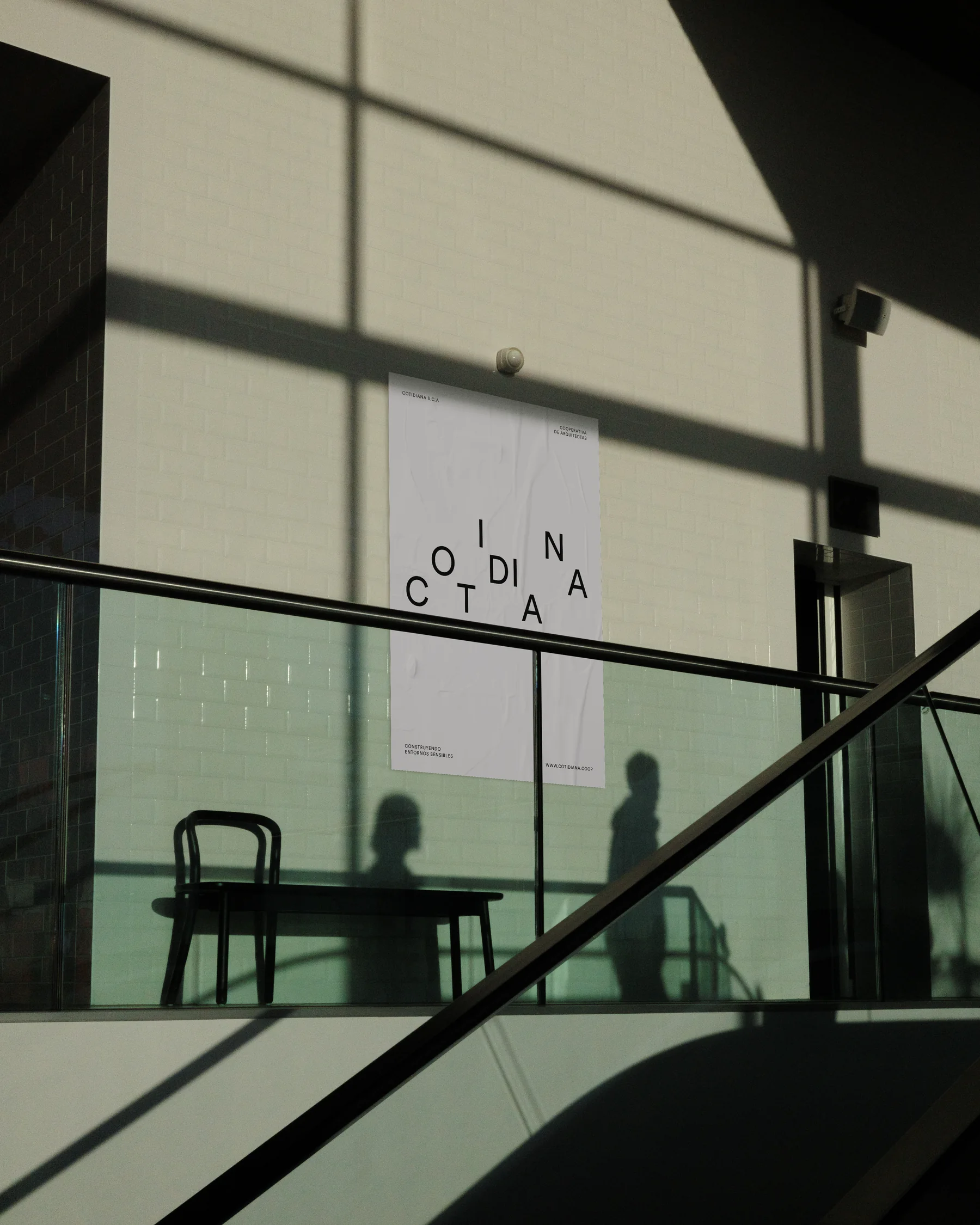
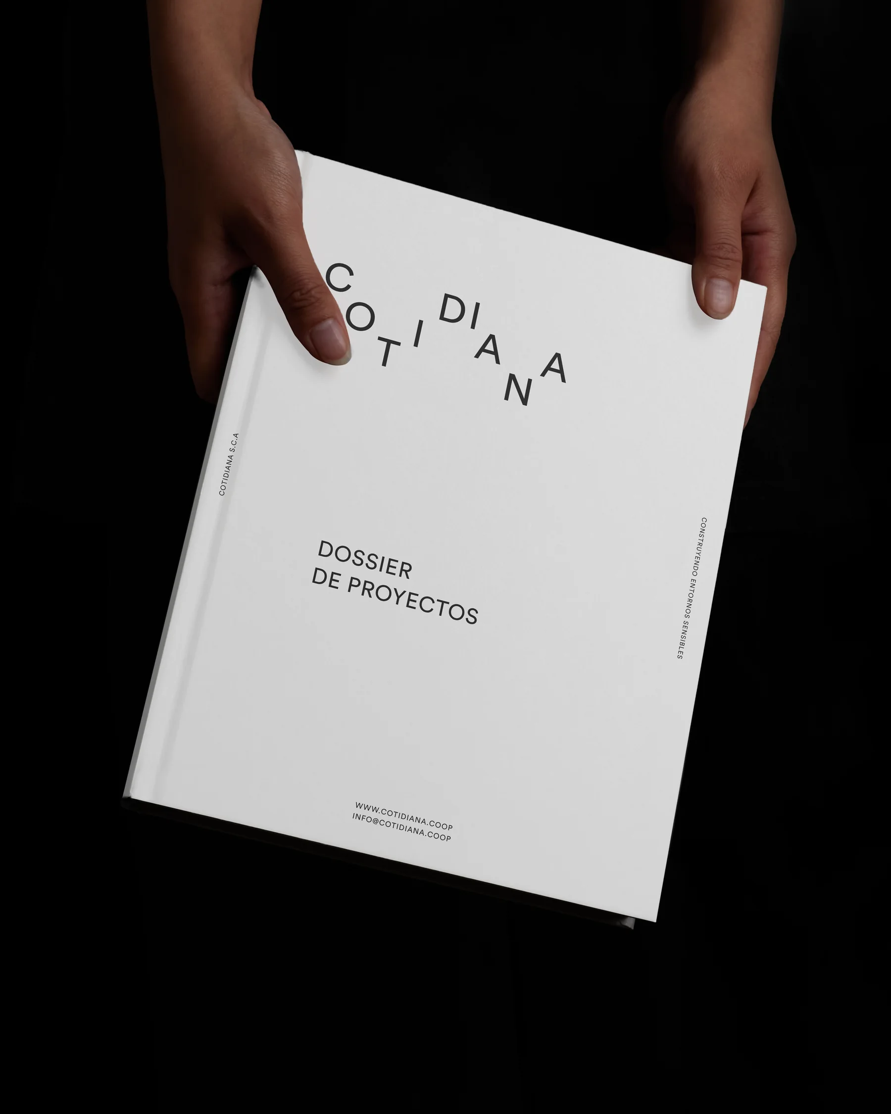
Rain, blow, simmer, wash, tidy. The nine letters of the name perform each of these gestures on a nine-by-nine module grid. The composition changes; the name always reads.
A verb for each project.
A series of posters with their architecture projects: C3 in Viso del Alcor, the Women’s House in Dahla, the school canteen prototype. Each one signs off with its own gesture and all return to the same name.
A website that moves.
We also designed their website, cotidiana.coop. The logotype moves in the header and the same logic carries over to the words of their work: architecture, city, cohousing, participation. Each project has its own page, with the work at large scale and the verb that goes with it.
The same logic carries over to the words of their work. Architecture curves, city splits, participation steps down: each service makes its own gesture.
Each document, a verb.
Reports, technical documents and proposals share layout and typography. Pages are laid out on the same modules that organise the letters of the logotype: title, photograph and columns fit the grid. Only the logo’s gesture changes, and together they line up again into the same name.
Cotidiana
A brand that doesn’t stand still, like architecture made with the people who live in it.
If you are looking for an identity for an architecture studio, a cooperative or a project with a social purpose, let’s talk.
Have a similar brief?
Tell us about it