CaseDistribution · Rebranding
Grupo Unase
A symbol for a national network.
Rebranding for a national network of electrical supply distributors. Union, territory and energy brought together in one symbol.
- Project
- Grupo Unase
- Field
- Electrical supply distribution · Spain
- Type of brief
- Evolution of an existing identity
- Work by ANTES.
- Strategy
Branding
Corporate identity
Logo design
Graphic design
Visual system
Corporate applications
Web design
Grupo Unase brings together companies specialised in distributing electrical supplies across Spain. It is an organisation built on collaboration between professionals, with an identity that needed to evolve to reflect its national scale and adapt to new digital environments.
The starting point was to keep what had always defined the organisation: the union of its members, its presence across the country and its specialisation in the electrical sector.
Three ideas brought into a single form.
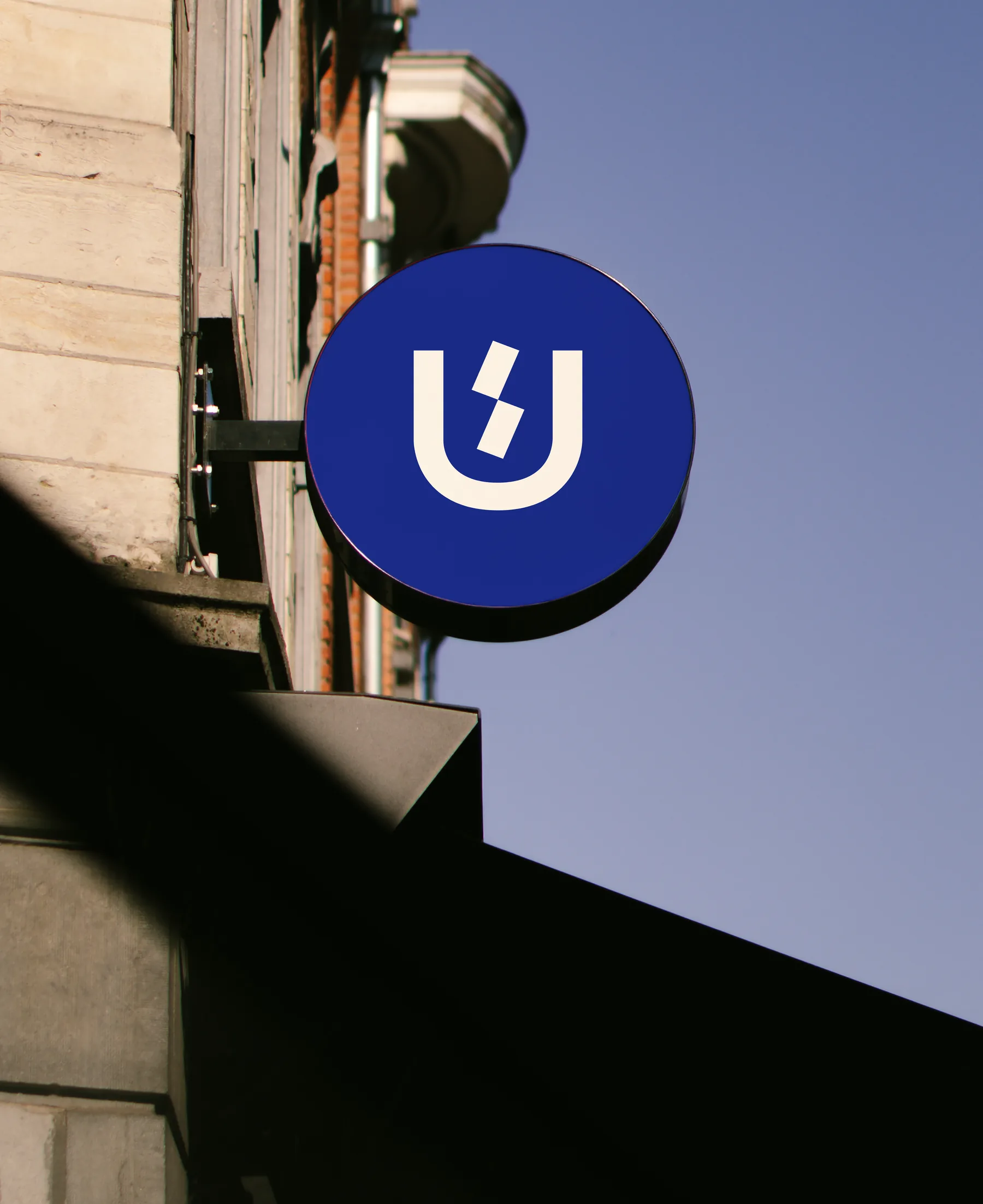
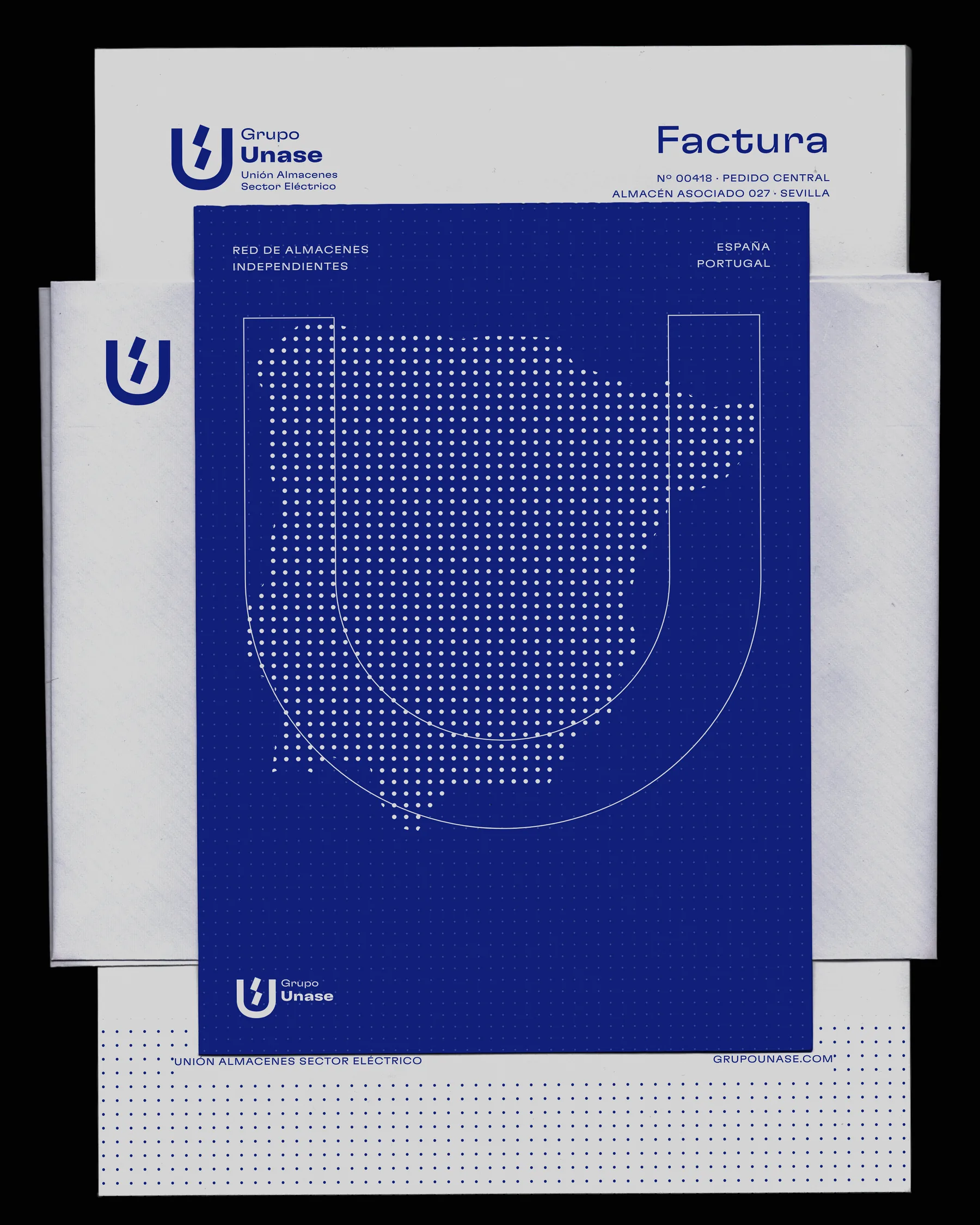
The new identity comes from a process of geometric abstraction. We took the outline of the Iberian Peninsula as a territorial reference, the shape of the “U” to express the name and the idea of union, and the lightning bolt as a symbol of electrical activity.
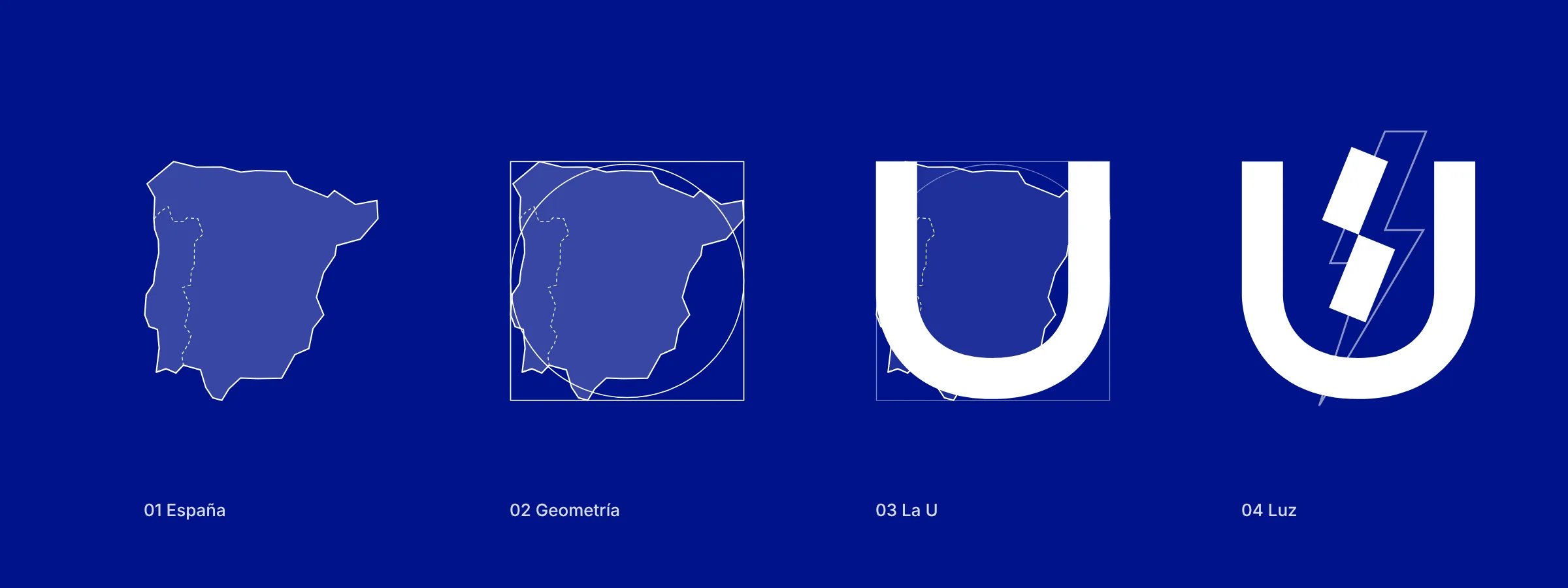
By simplifying and standardising these elements we built a symbol that brings the three references together without a literal depiction.
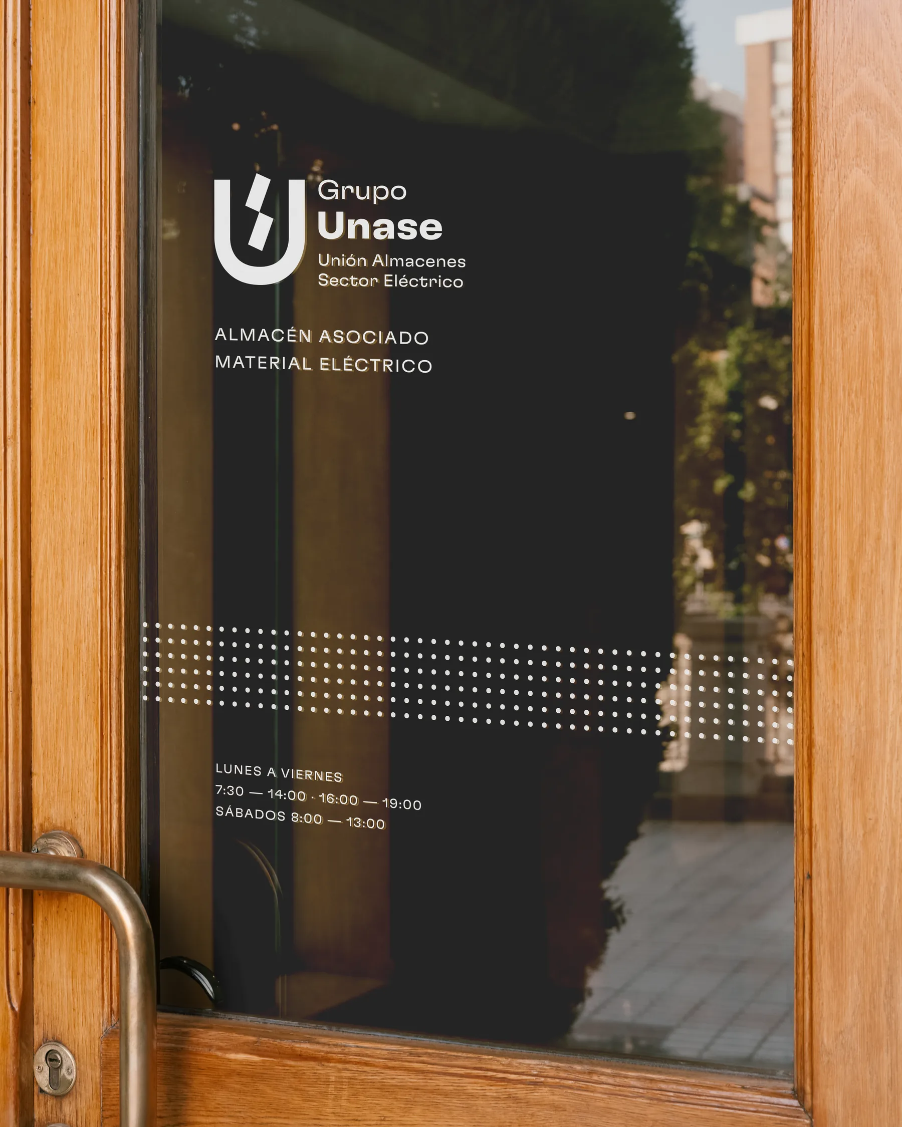
The visual system grows from the same search for synthesis. Pantone Reflex Blue, combined with white, gives a recognisable colour presence. The Flexa Extended typeface brings a contemporary, precise voice, while dot patterns extend the graphic language and connect visually with the idea of network and territory.
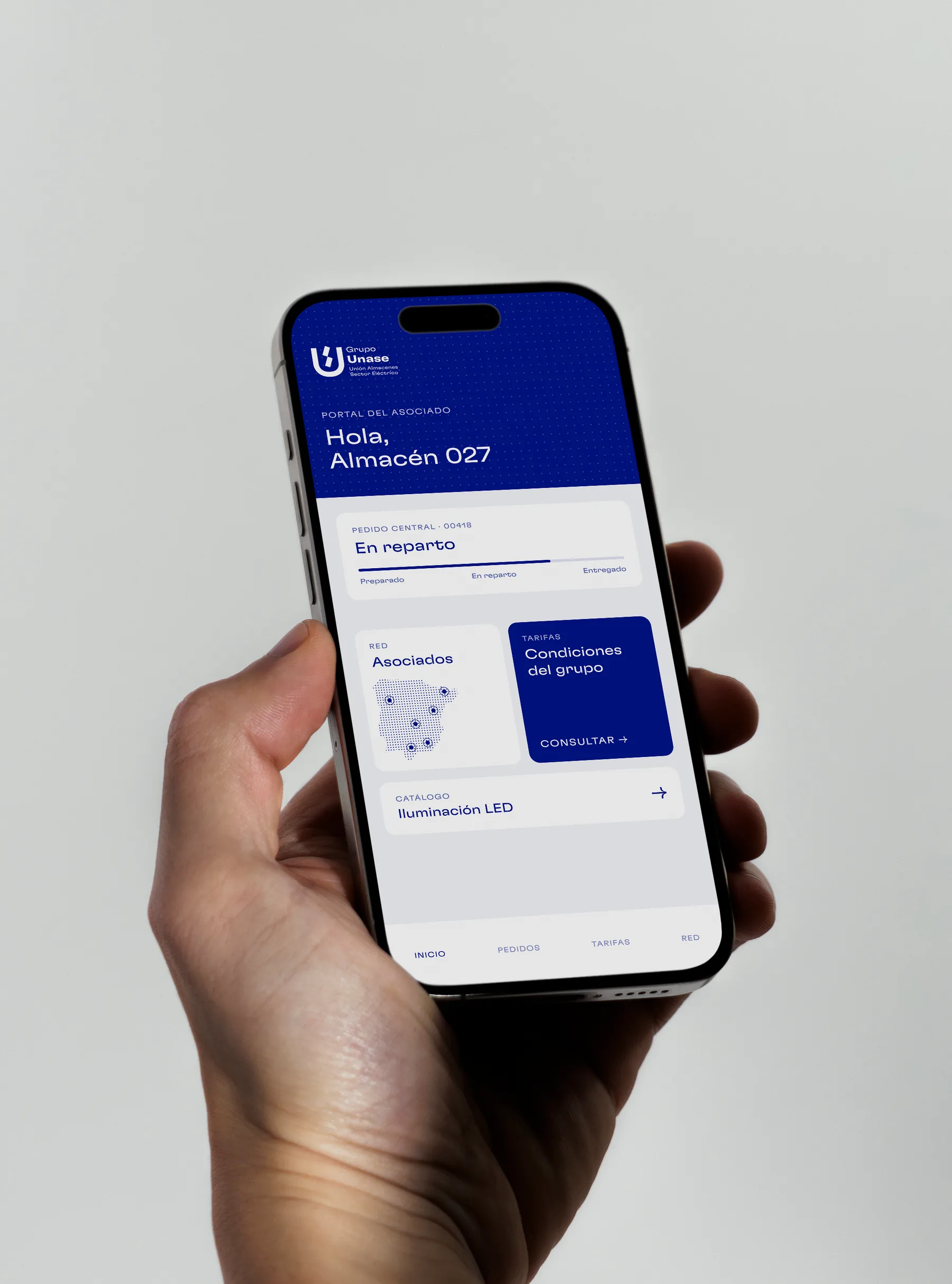
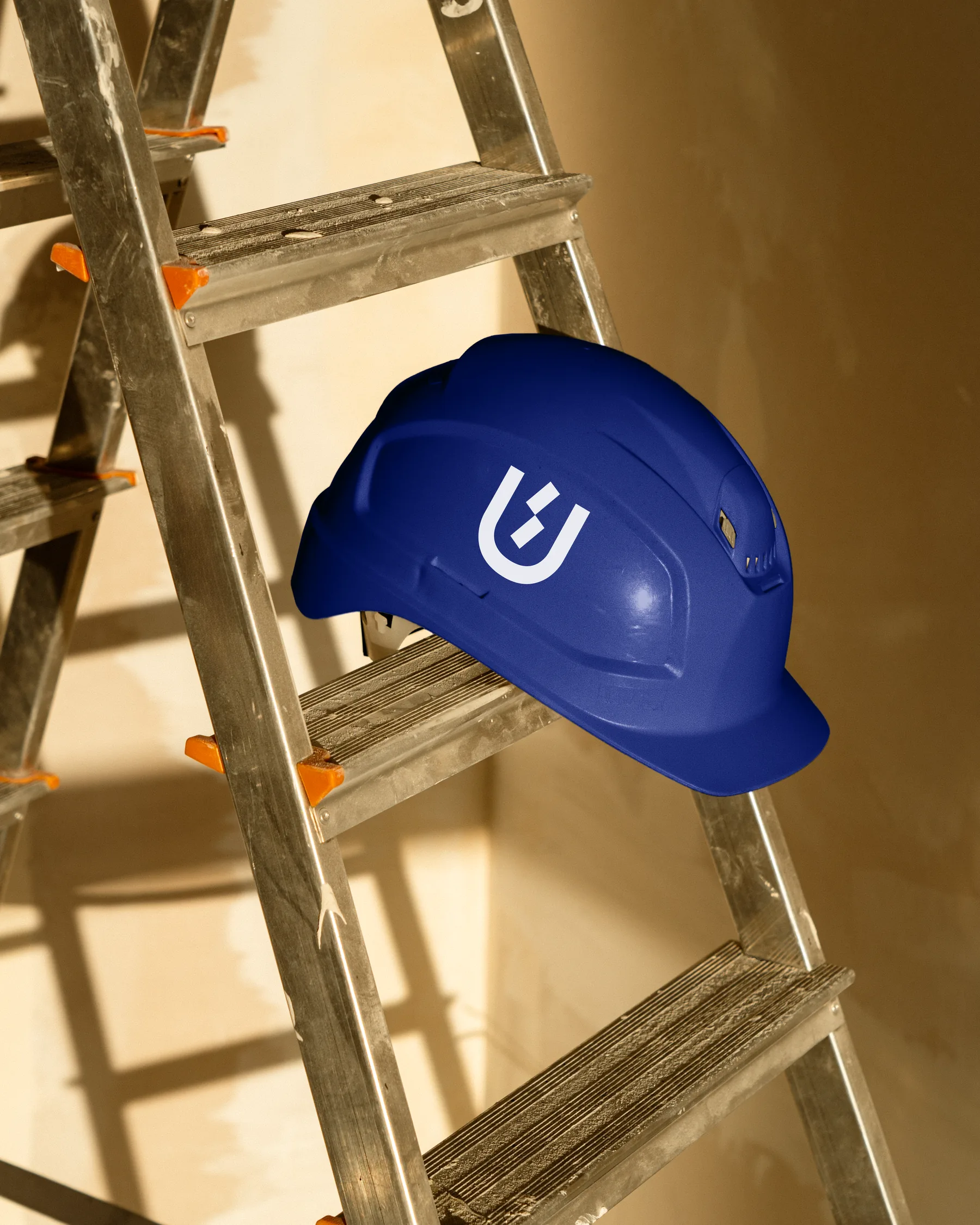
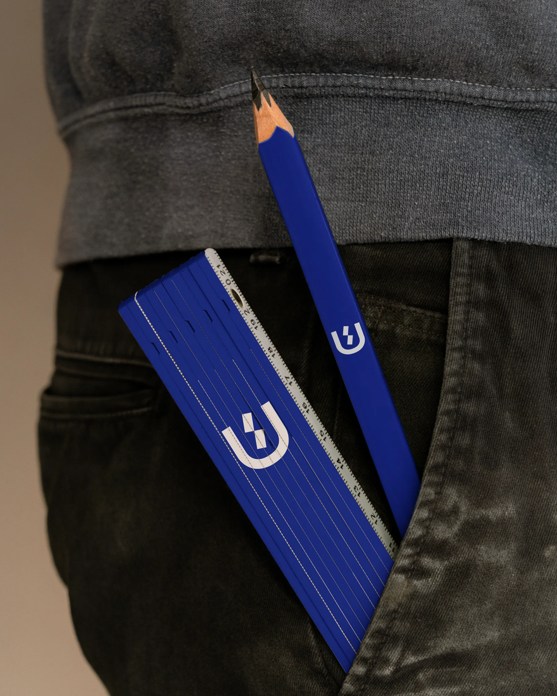
Logotype, textures, stationery and corporate applications share a common structure that carries the identity across different formats and media.
Grupo Unase
An evolution that keeps the meaning of the brand and gives it new tools to express it.
Have a similar brief?
Tell us about it