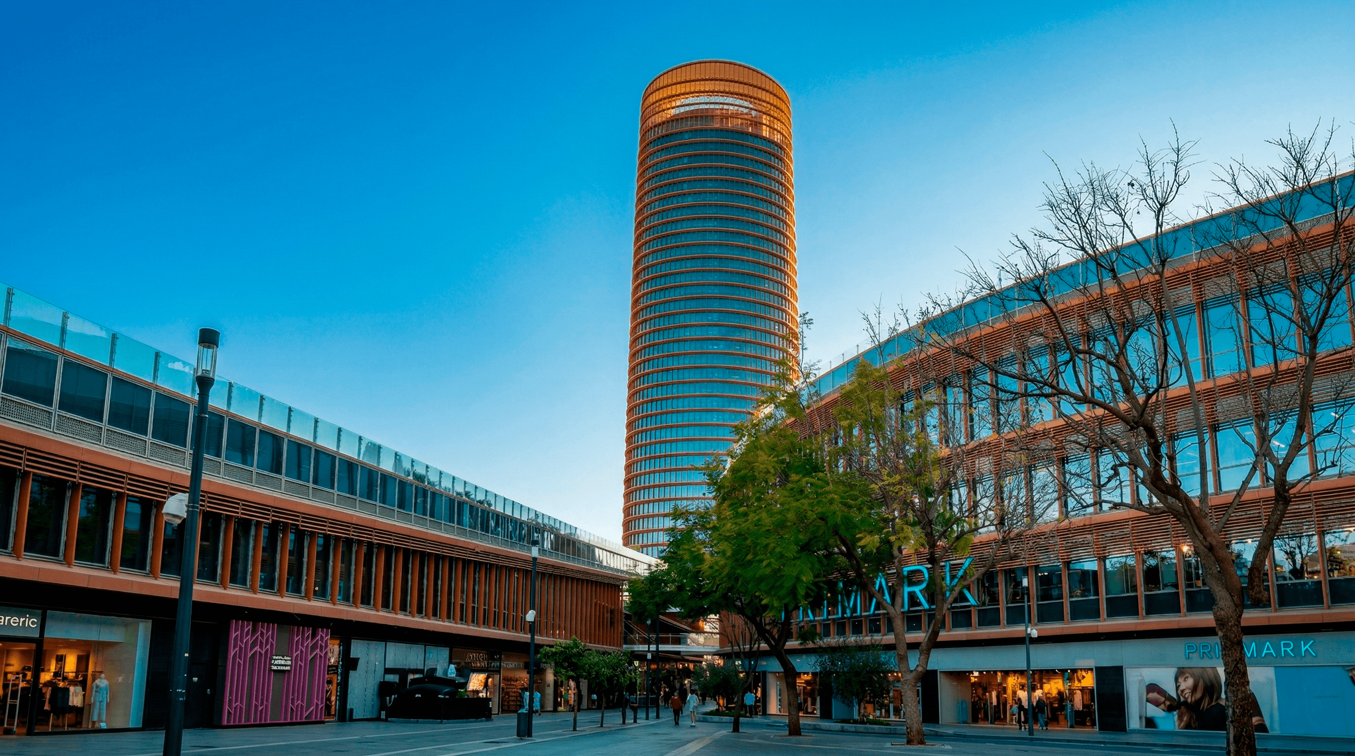
Reorganising an icon to redefine its role in the city Torre Sevilla is not a building. It is an ecosystem: tower, hotel, offices, viewpoint, shopping centre, green roofs, park and cultural spaces. Yet it operated as a sum of parts. The challenge was to turn it into a brand with vision, structure and the capacity for urban leadership.
We did not just design an identity. We redefined its brand architecture.
A brand to bring order to complexityA strategic analysis of the existing model revealed a loosely articulated monolithic structure. The solution was to evolve towards a nuanced monolithic model: a strong parent brand —TORRESEVILLA— as endorser and driver of reputation, with sub-spaces that have their own personality yet always remain anchored to the whole.
Architecture does not only organise brands. It organises perception, experience and value.
Naming to positionThe reorganisation demanded clarity. The naming redefines the complex as a recognisable, international system:
The surname describes the function. The parent brand brings status.
Each space gains its own identity without losing collective strength.
An identity born of the place The identity is not imposed on the architecture. It emerges from it. The verticality of the tower, its sloping cut, the galleries, the green roofs and the river are abstracted into a typographic system that turns the name itself into structure. “TORRESEVILLA” is no longer just text. It becomes form, rhythm and skyline.
The logo does not represent the building. It behaves like it.
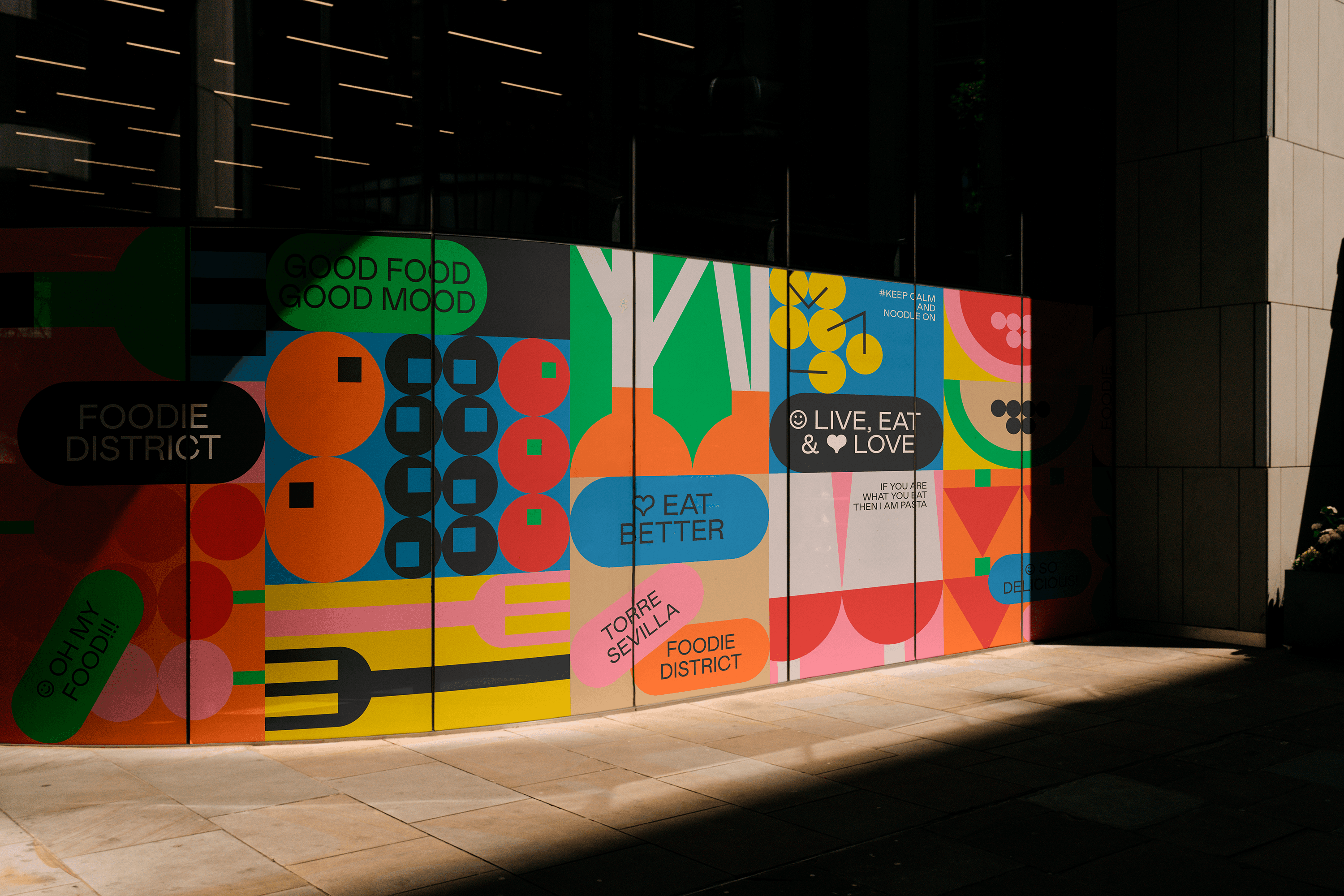
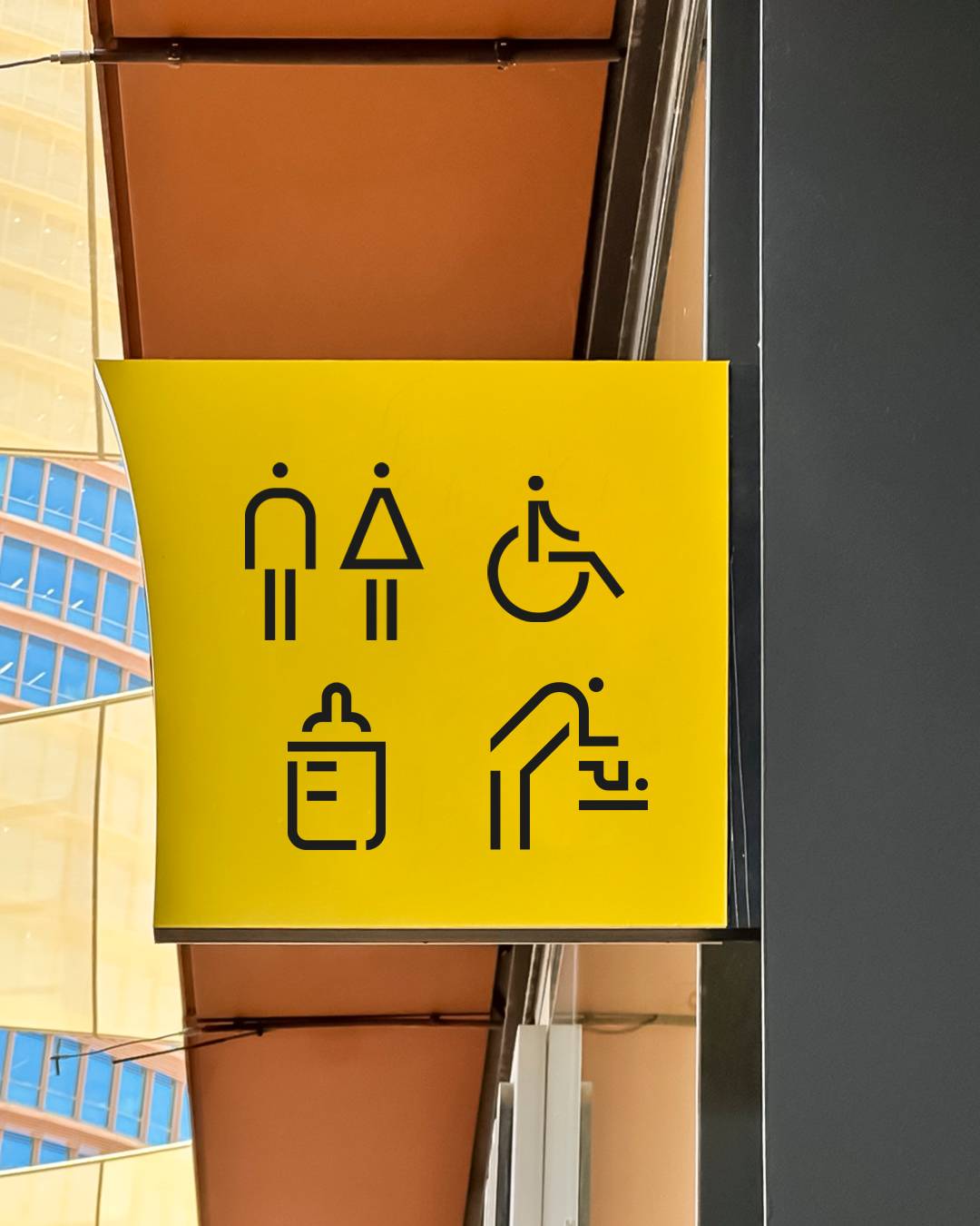
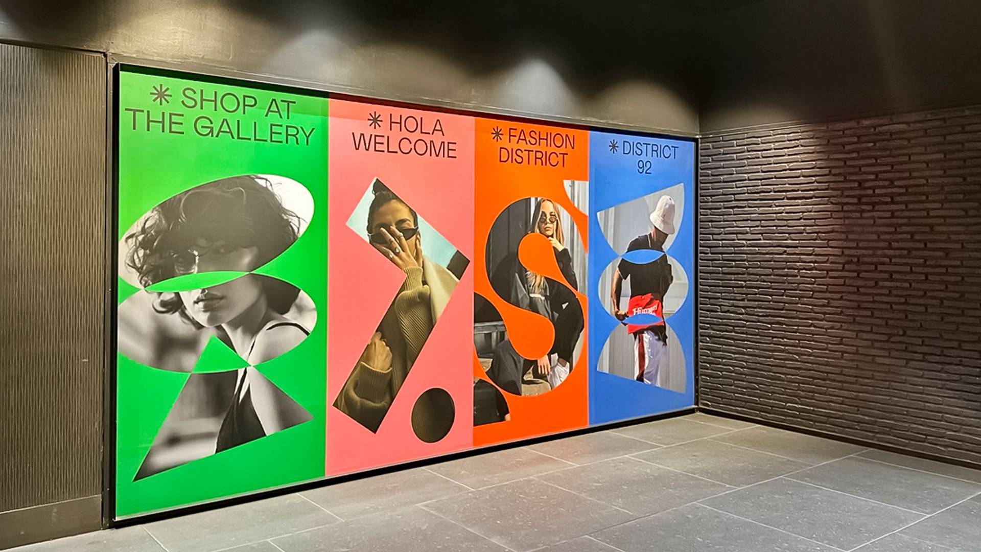
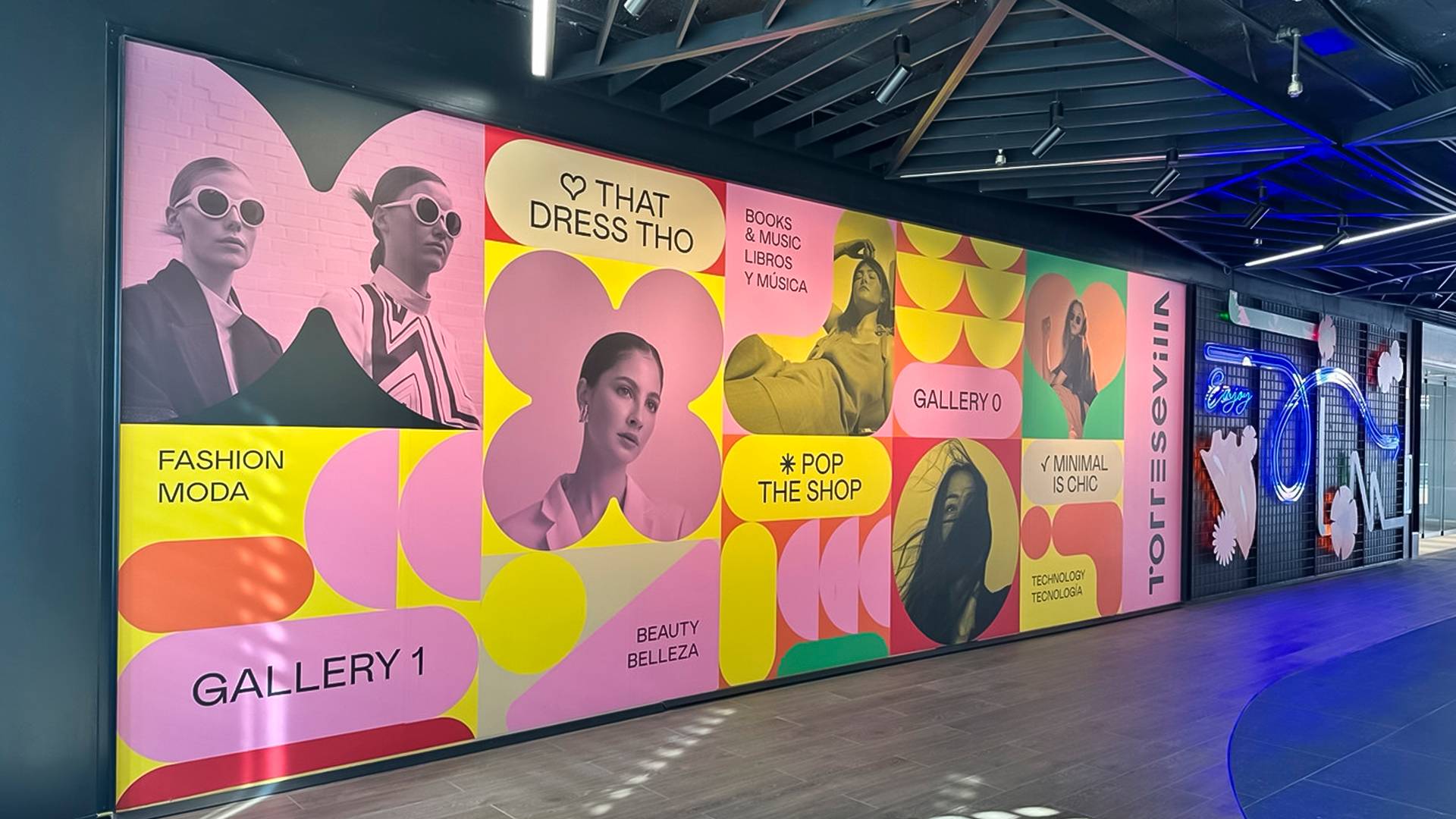
System as infrastructureThe visual system is built on a modular logic based on the proportions of the logo. This unit governs signage, campaigns, editorial pieces and the physical environment.
The identity works as an invisible infrastructure that organises the visitor experience. Colour, strategically assigned to each space, acts as a tool for wayfinding and emotional differentiation.
It is not aesthetics. It is navigation.
The impact Torre Sevilla goes from being a mixed-use complex to a structured urban brand. The new brand architecture clarifies the offer for visitors and tourists, reinforces commercial appeal for operators and partners, and c onsolidates the complex as a contemporary icon of Seville.
Identity as a system of cohesion. Brand as a tool for the city.