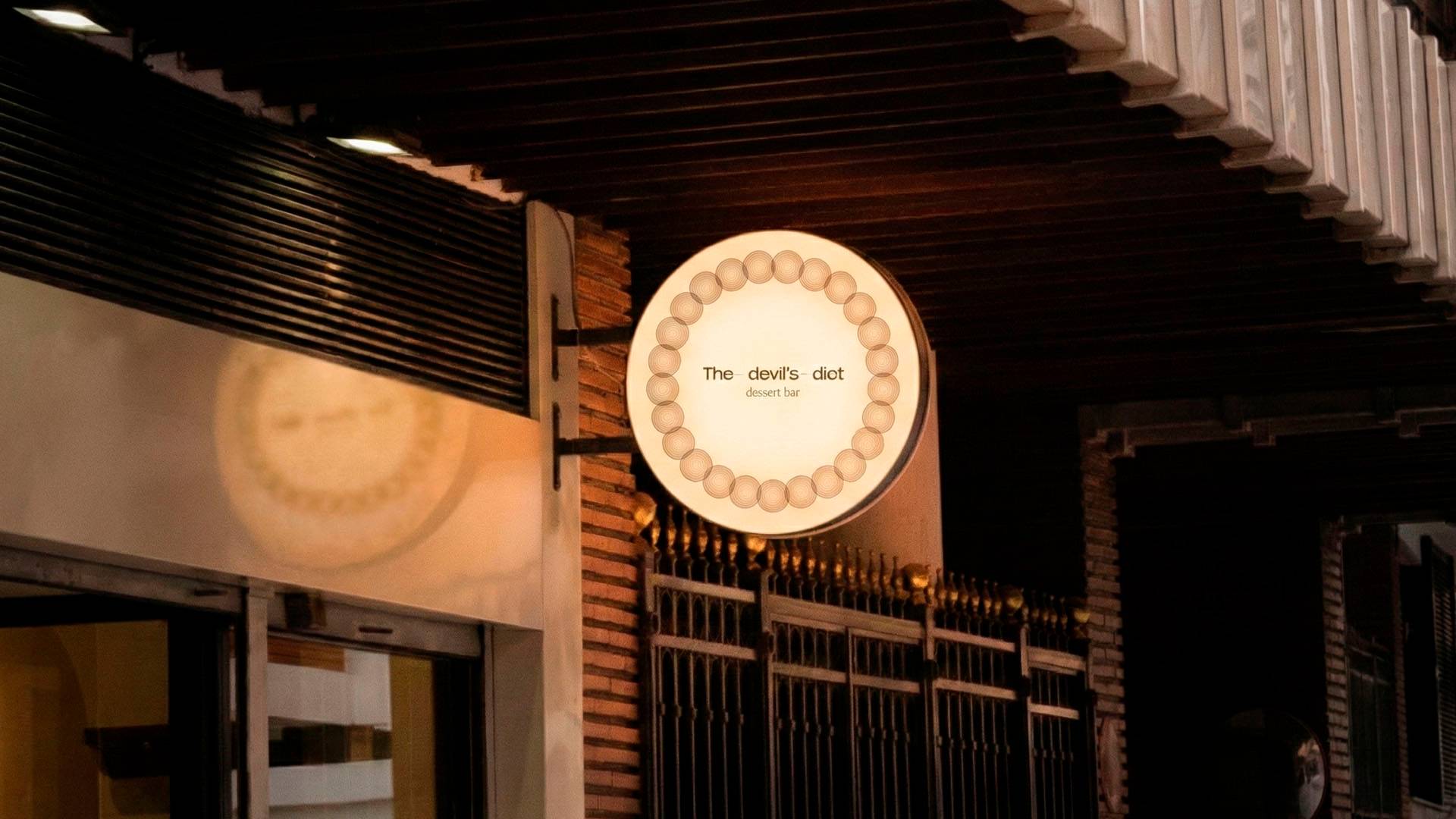
Identity for a Dessert Bar in New Haven The Devil’s Diet is a restaurant specialising in desserts and coffee in New Haven, Connecticut, home to Yale University.
More than a restaurant, it works as a dessert bar: a place where patisserie, coffee and wine take centre stage.
We developed its visual identity and graphic system.
The Idea
A name that speaks of excess and guilty pleasure. From there, we connected the project with Dante’s Divine Comedy. The circles of hell described by Dante became the conceptual and formal basis of the system.
A literary reference turned into graphic language.
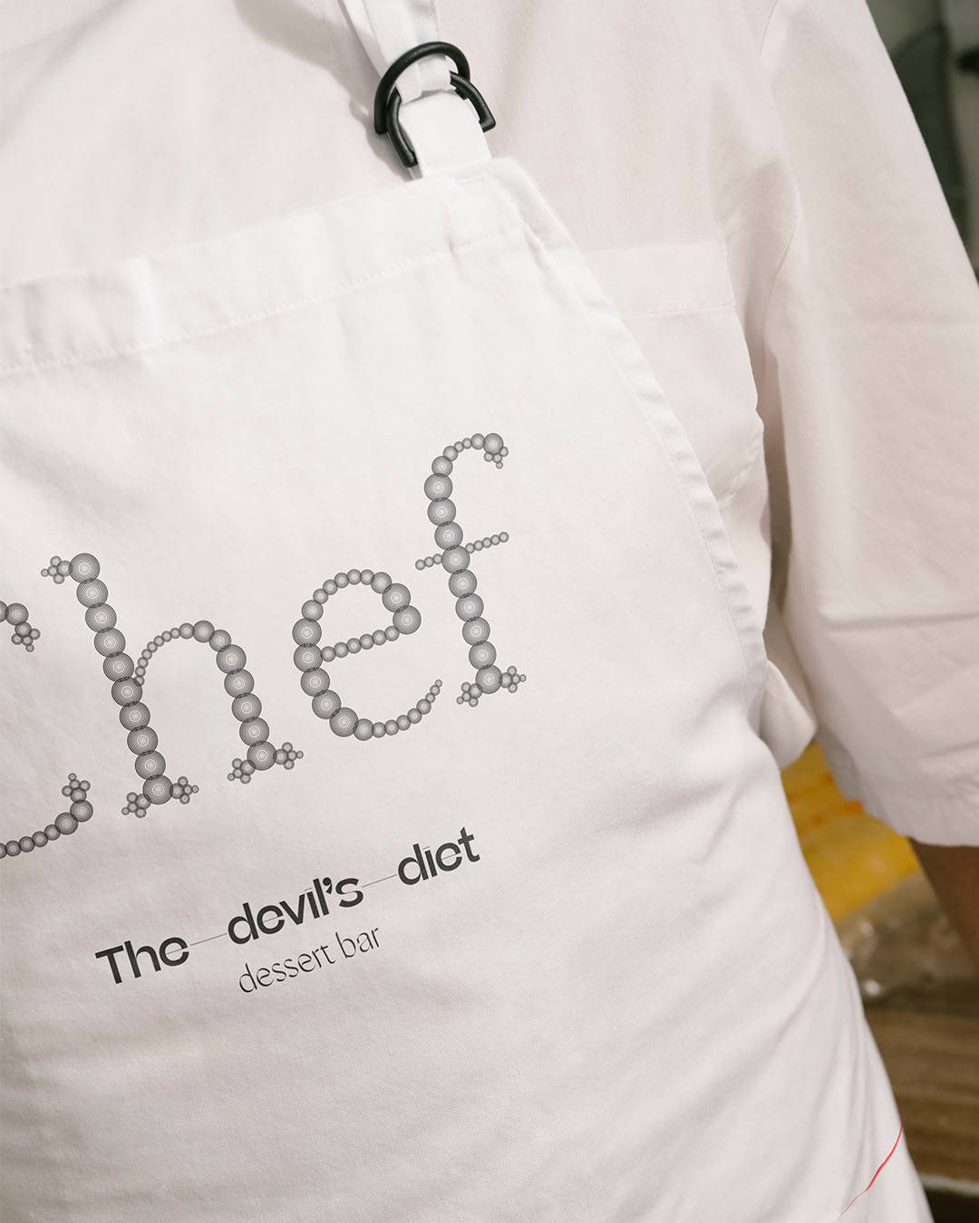
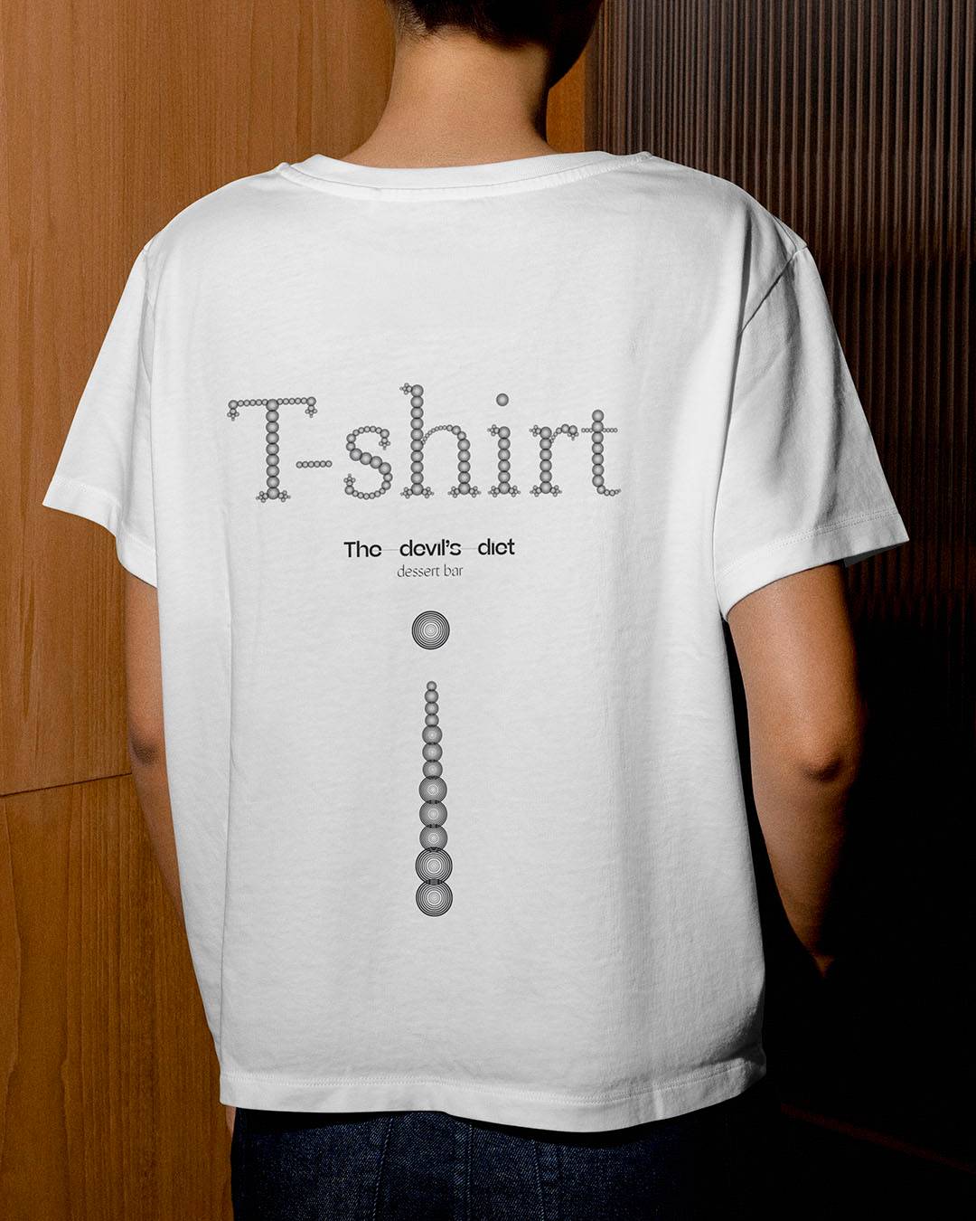
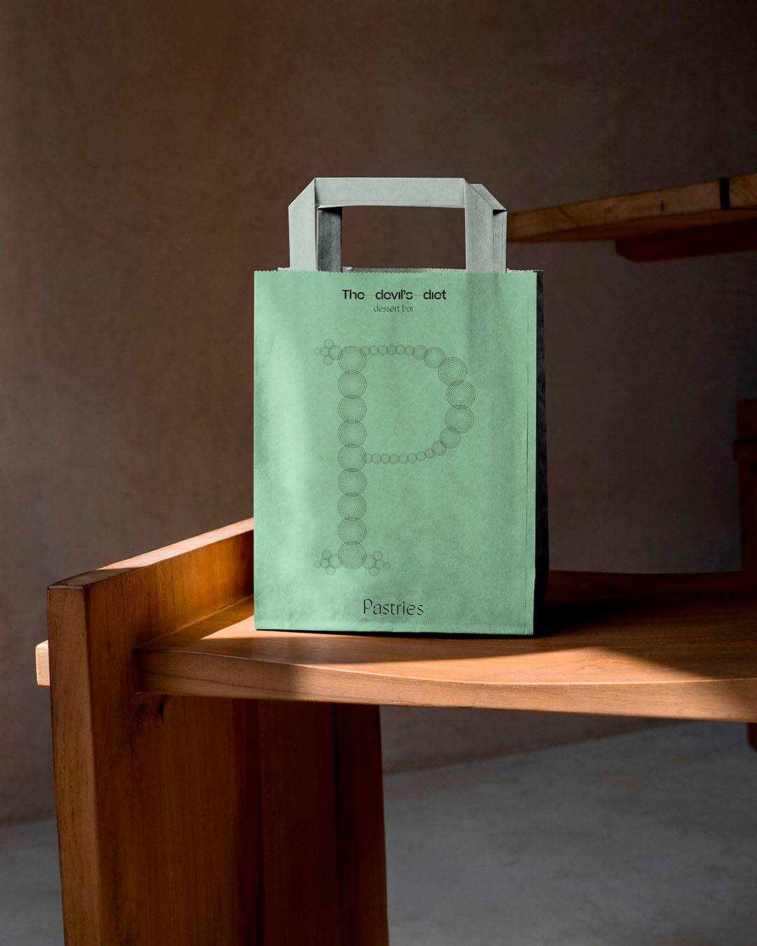
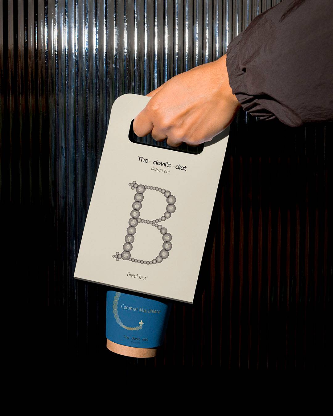
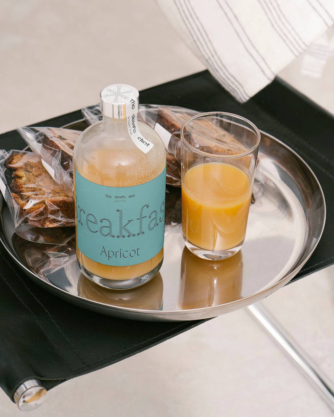
Typography We designed a lettering typeface built from circular modules. The letters are formed by repeating small concentric circles.
The result is an ornamental typeface that also visually recalls the finishes and decorations of patisserie: glazes, filigree and cake structures.
Lettering that looks almost piped from a pastry bag.
li Guit
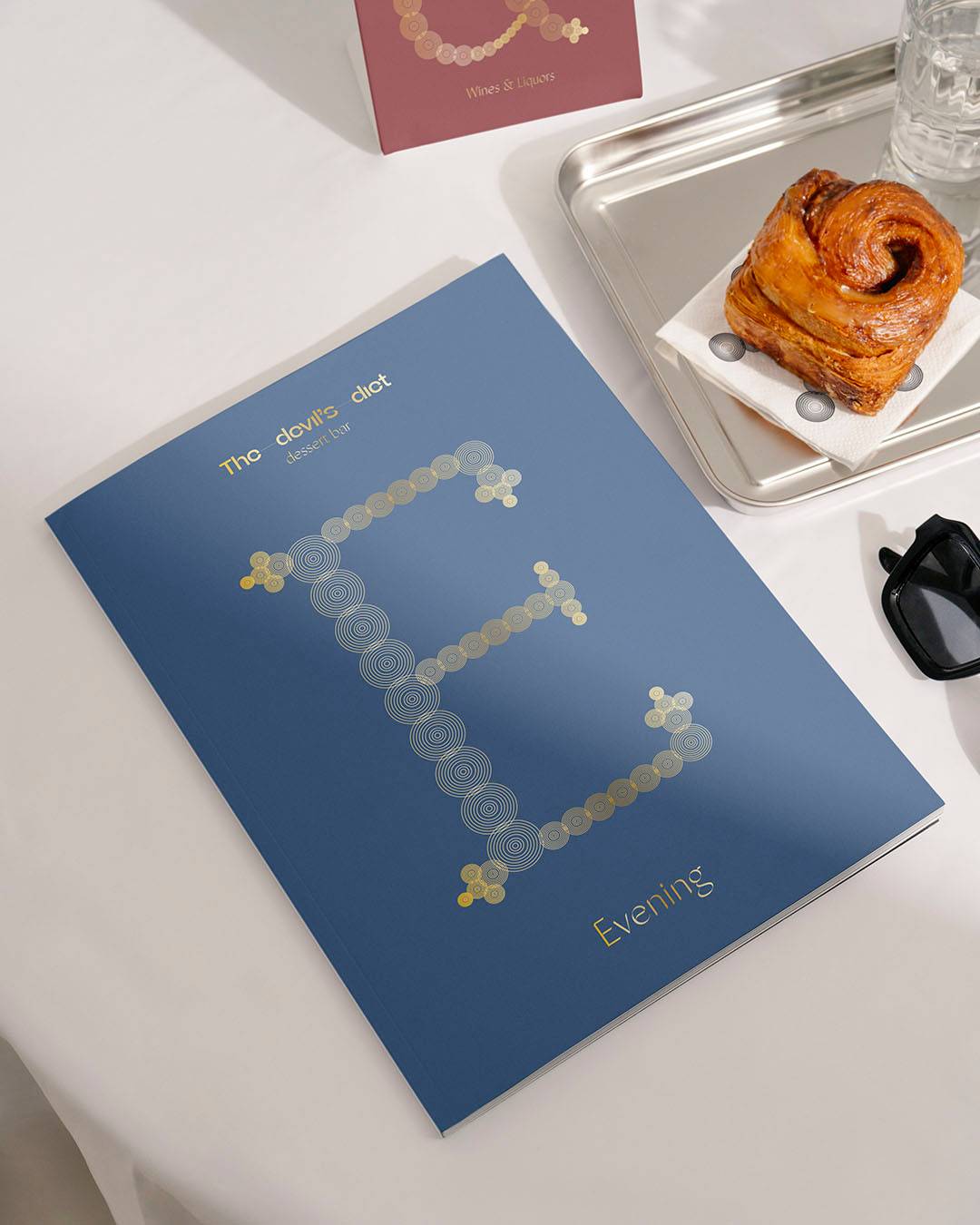
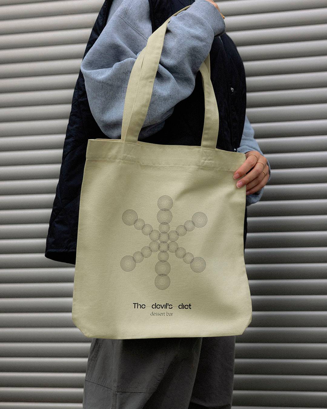
Visual system The circular units that build the typeface expand to create an ornamental graphic system.
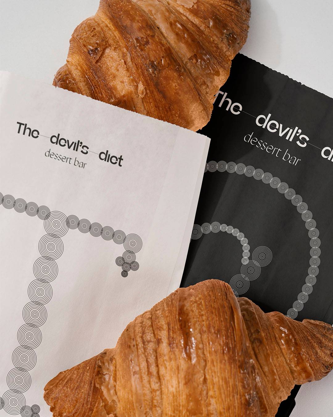
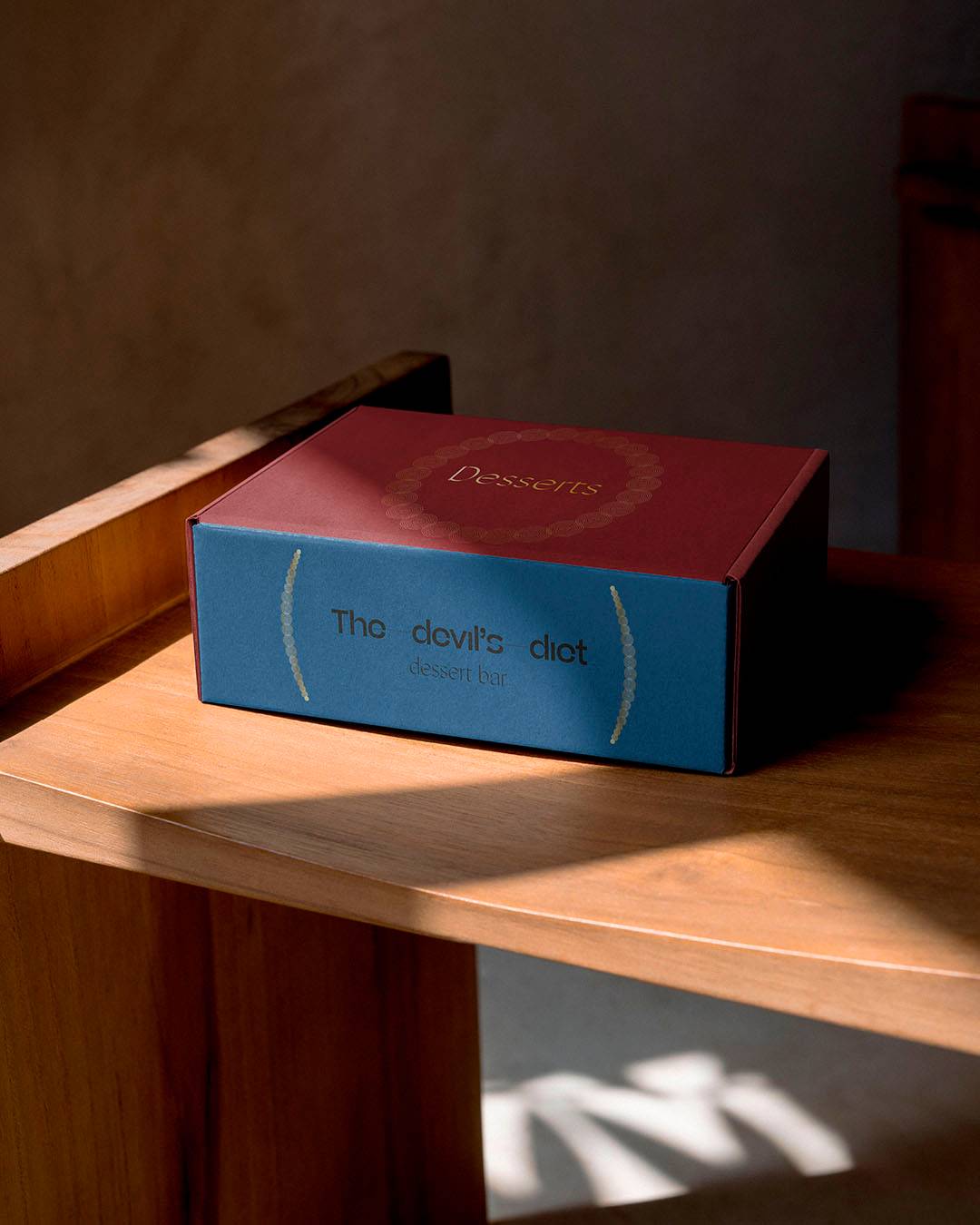
These modules form frames, patterns and compositions that accompany the logo and the communication pieces.
The result is an elegant, decorative visual language that gives the restaurant a highly distinctive personality.
Colour
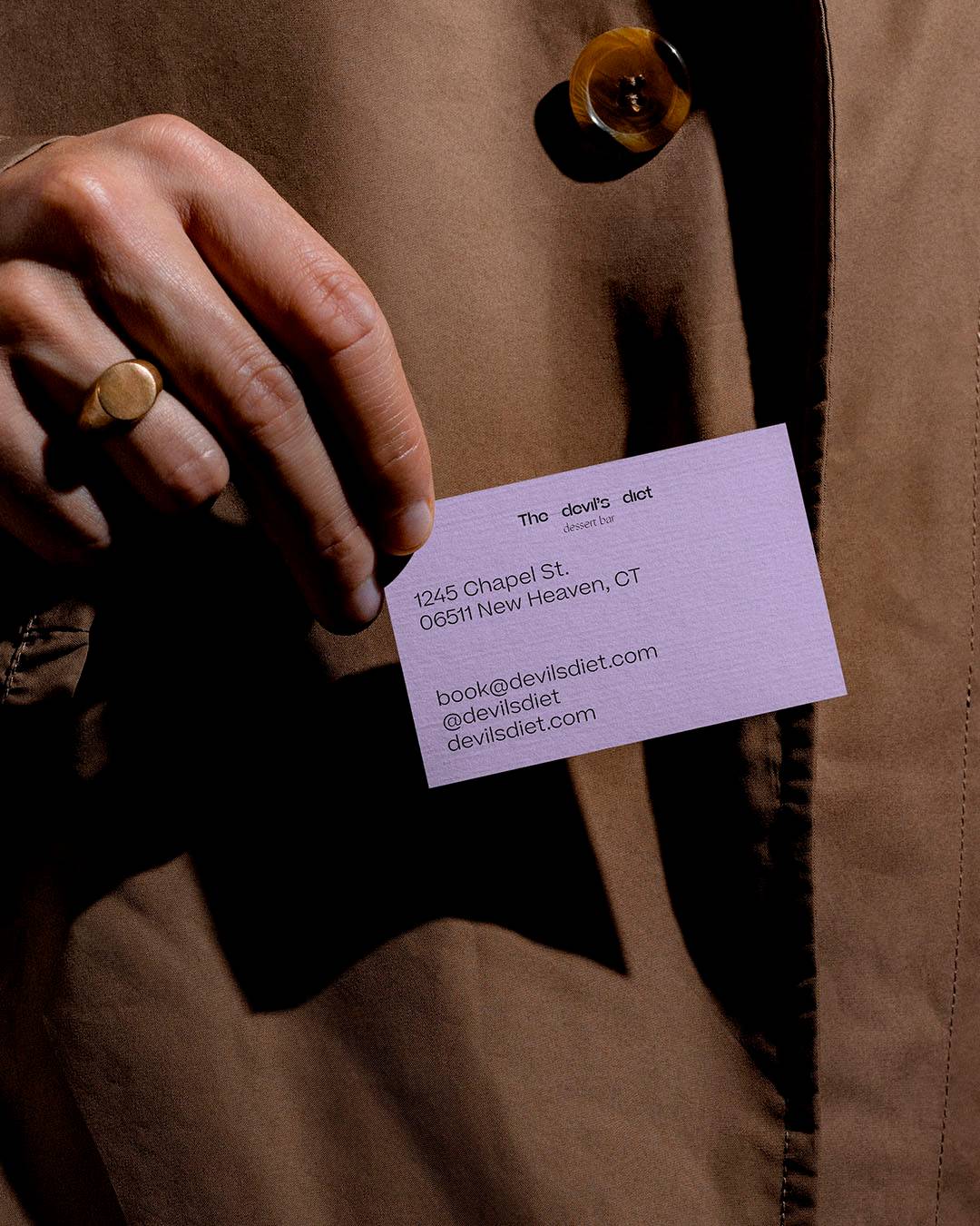
The identity uses a palette of pastel tones. Colours associated with the world of patisserie: macarons, creams, glazes.
Applied to Colorplan papers, they reinforce the handcrafted character of the project. Every element uses the same graphic vocabulary.
The identity works as a coherent set of small pieces.
The result
An identity built from literature, typography and repetition. An ornamental system that turns the logic of Dante’s circles into visual language.