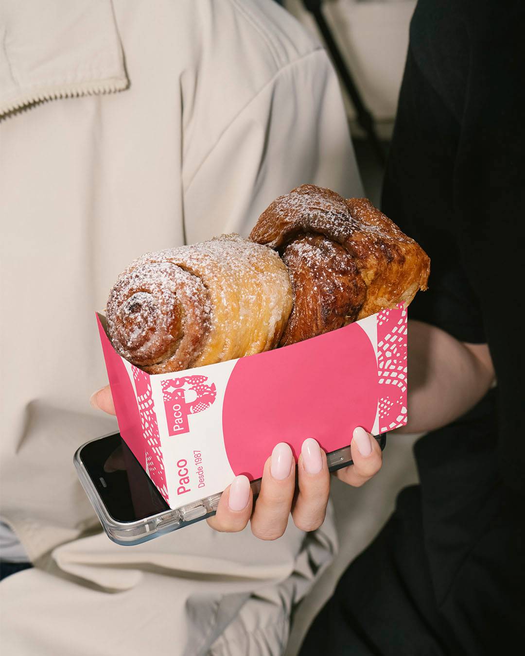
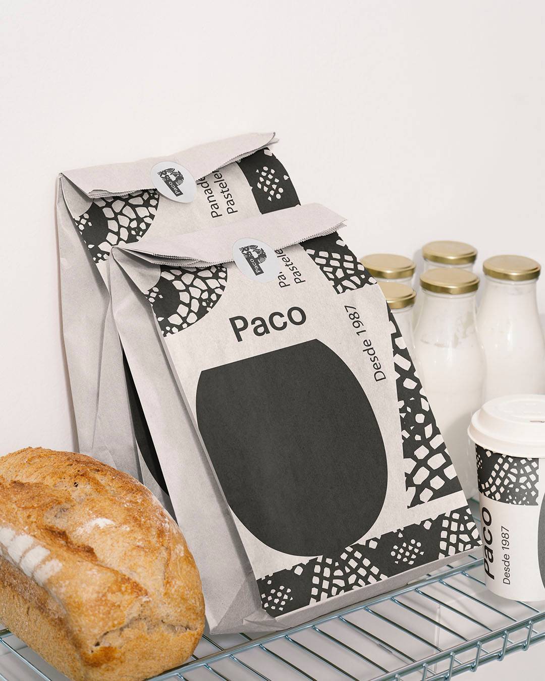
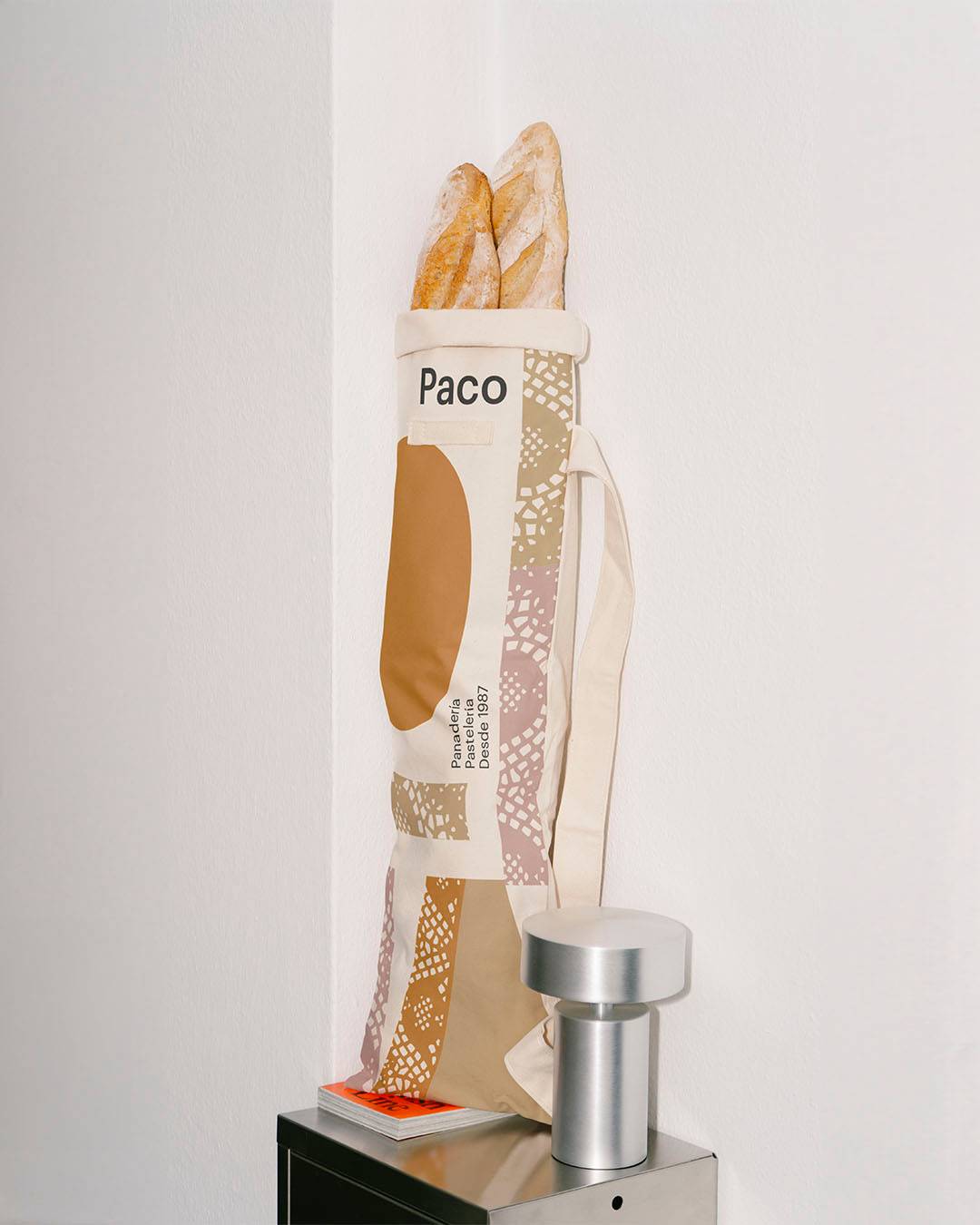
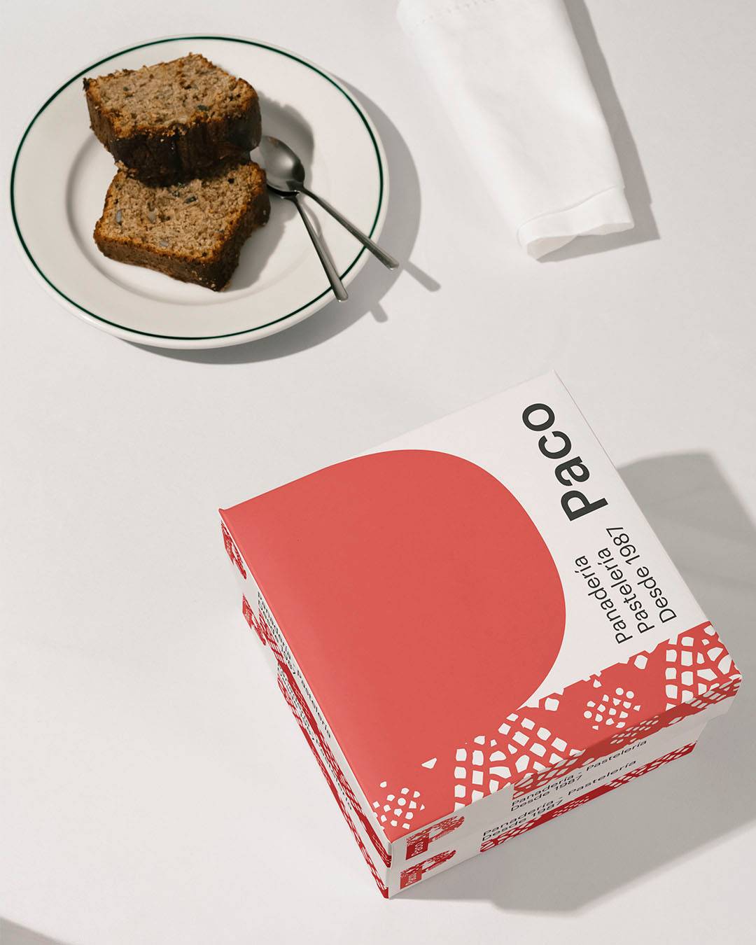
The challenge To build a contemporary identity for a bakery and patisserie with a history, without losing its bond with tradition. The aim was a solid, recognisable and flexible system, able to work across packaging, uniforms and point of sale. This was not about designing a logo, but about defining a structure.
The concept The identity starts from a familiar cultural object: the traditional pastry doily.
An everyday item, rooted in our collective memory, that connects with artisan tradition.
The doily is broken down into form and pattern. From there, the entire graphic system is built.
Identity The “P” of Paco becomes the main trait.
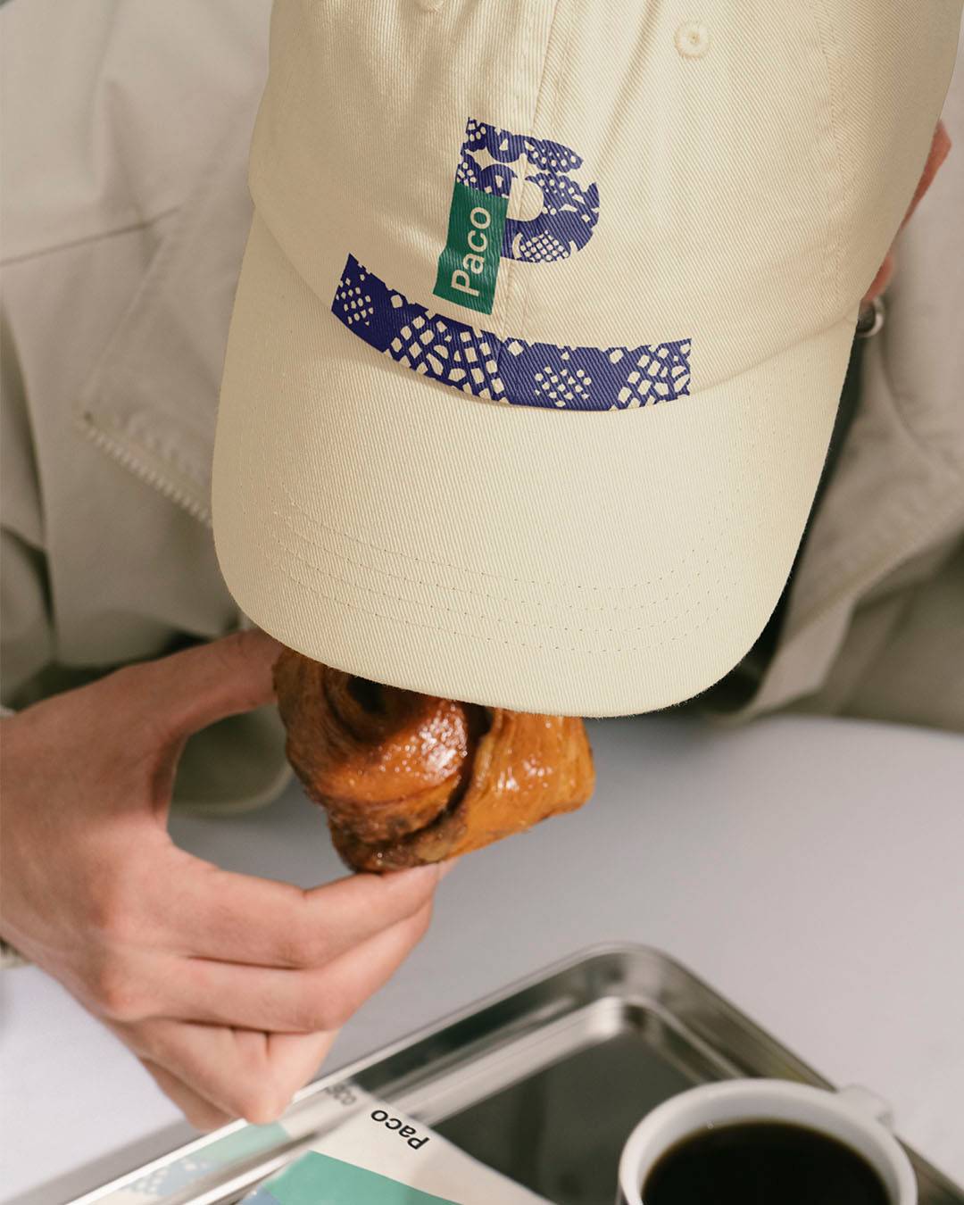
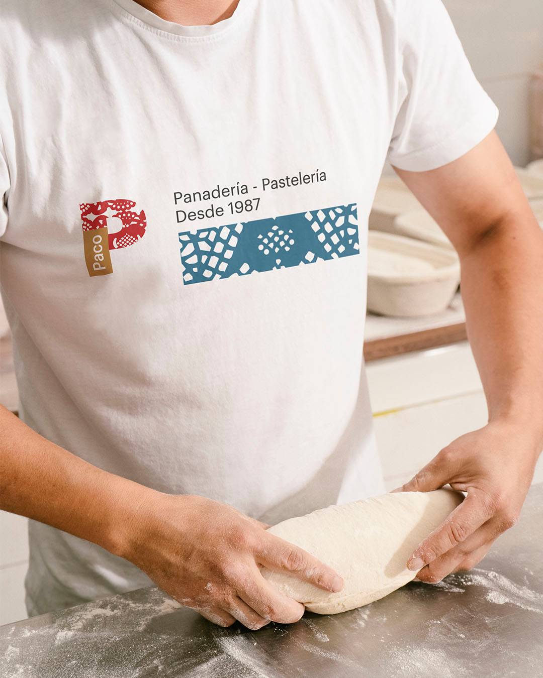
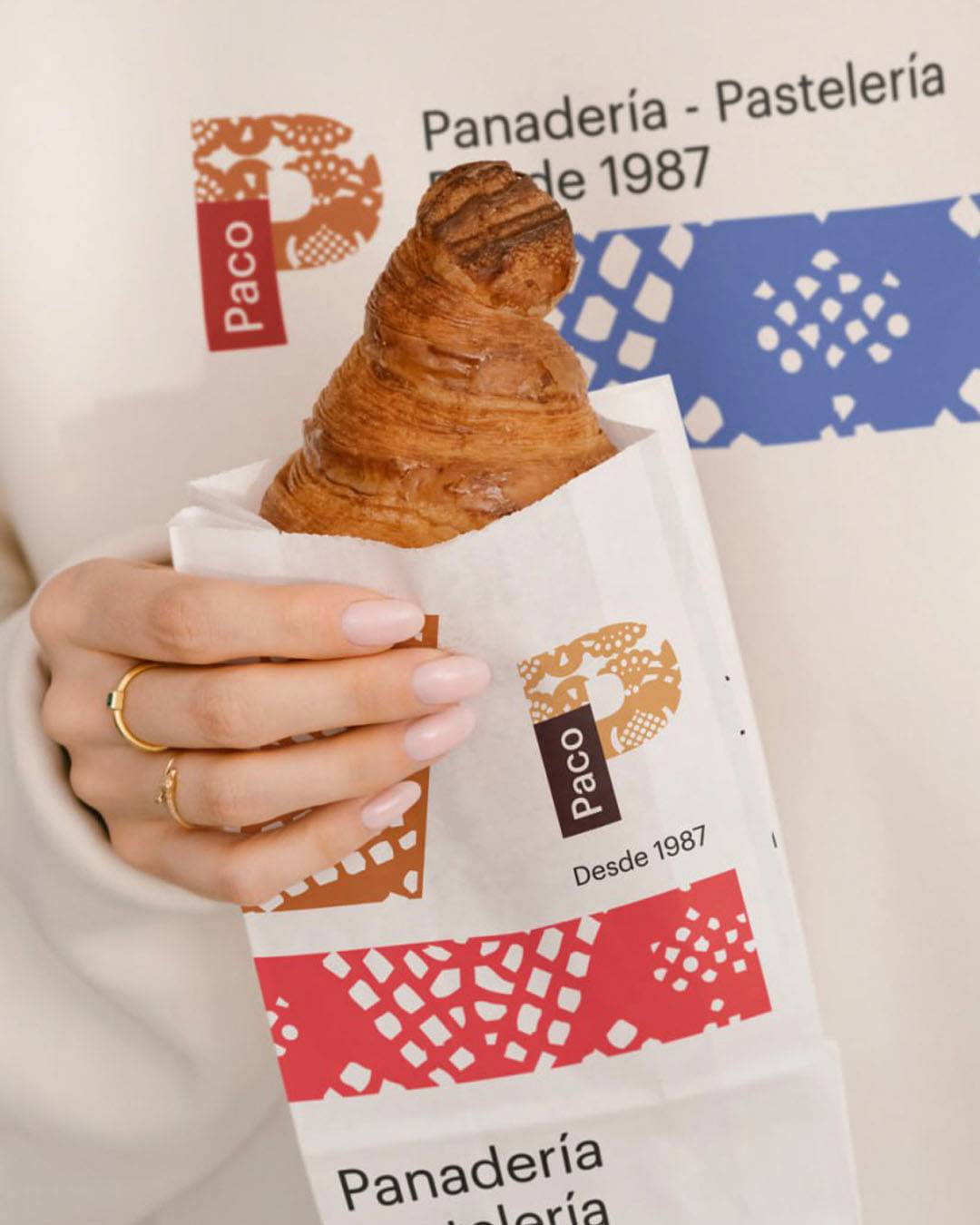
The combined mark brings together the lettering and the doily pattern within it, turning the letter into a vessel for meaning.
The brand is structured on a modular grid that sets proportions, hierarchies and spacing. The system does not rely on intuition: it relies on rules.
The “Paco” wordmark and the descriptors (“Panadería”, “Pastelería”, “Desde 1987”) act as secondary elements organised by the same logic.
Visual System The doily allows us to work at different levels of zoom.
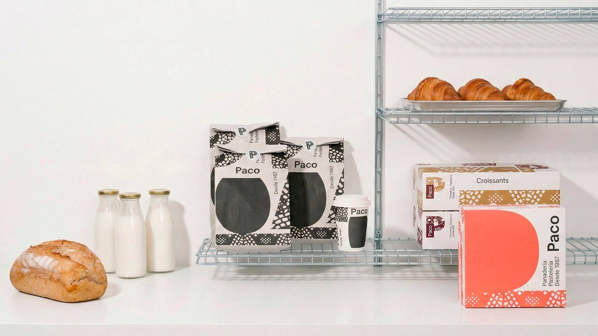
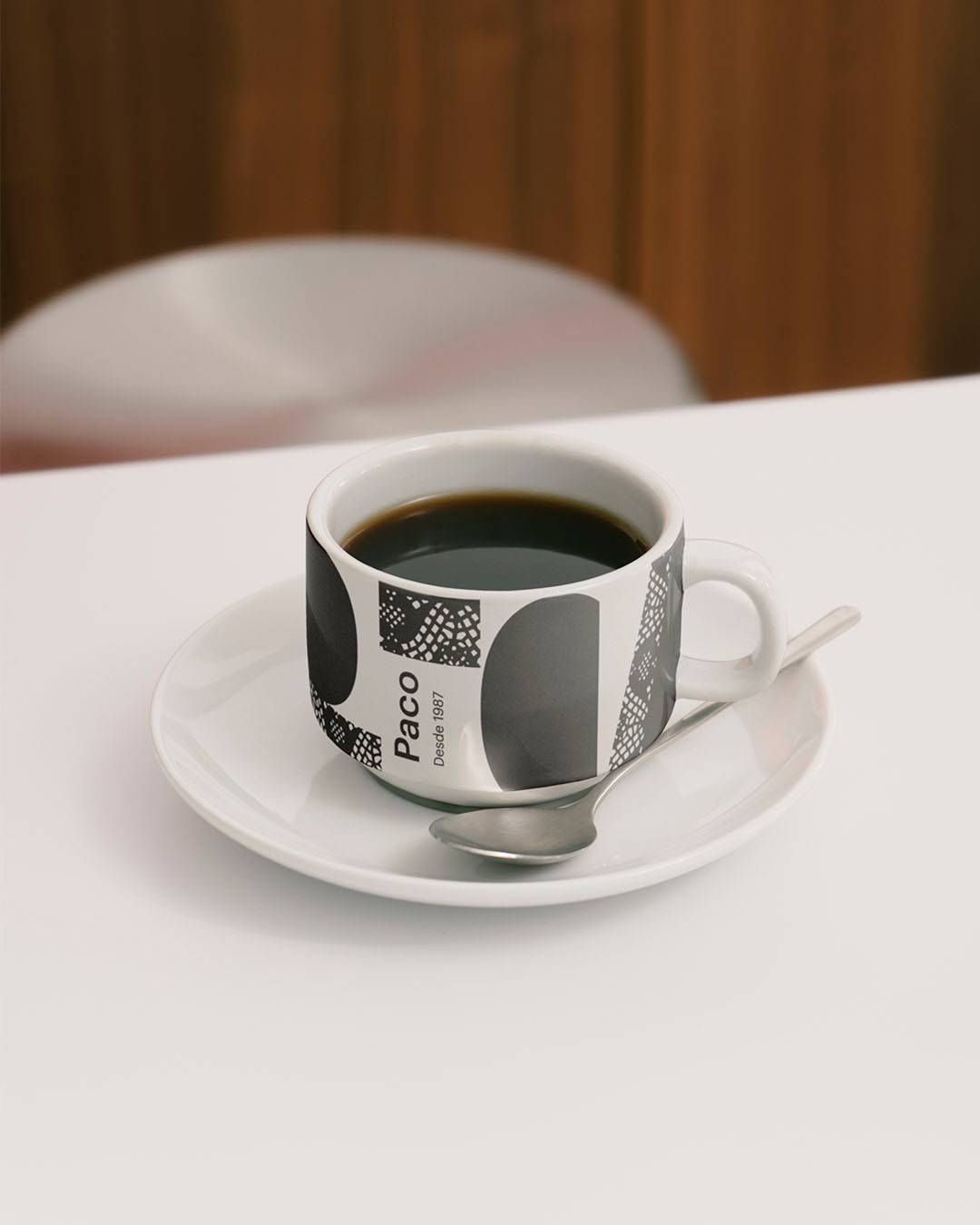
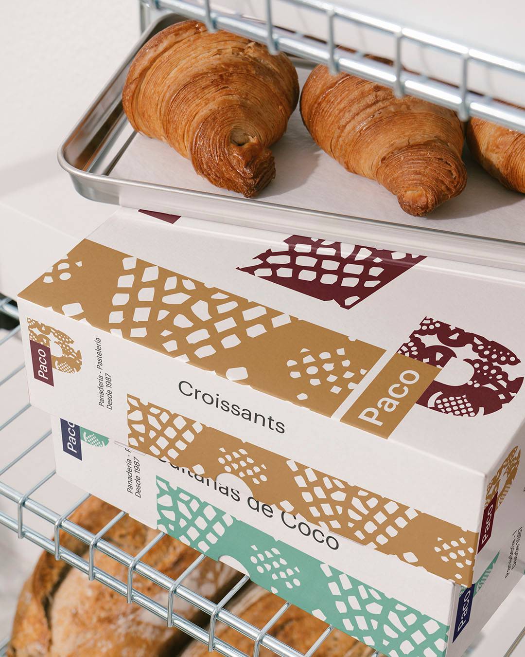
At macro scale, the lacework becomes abstract shapes that generate contemporary patterns for packaging and applications.
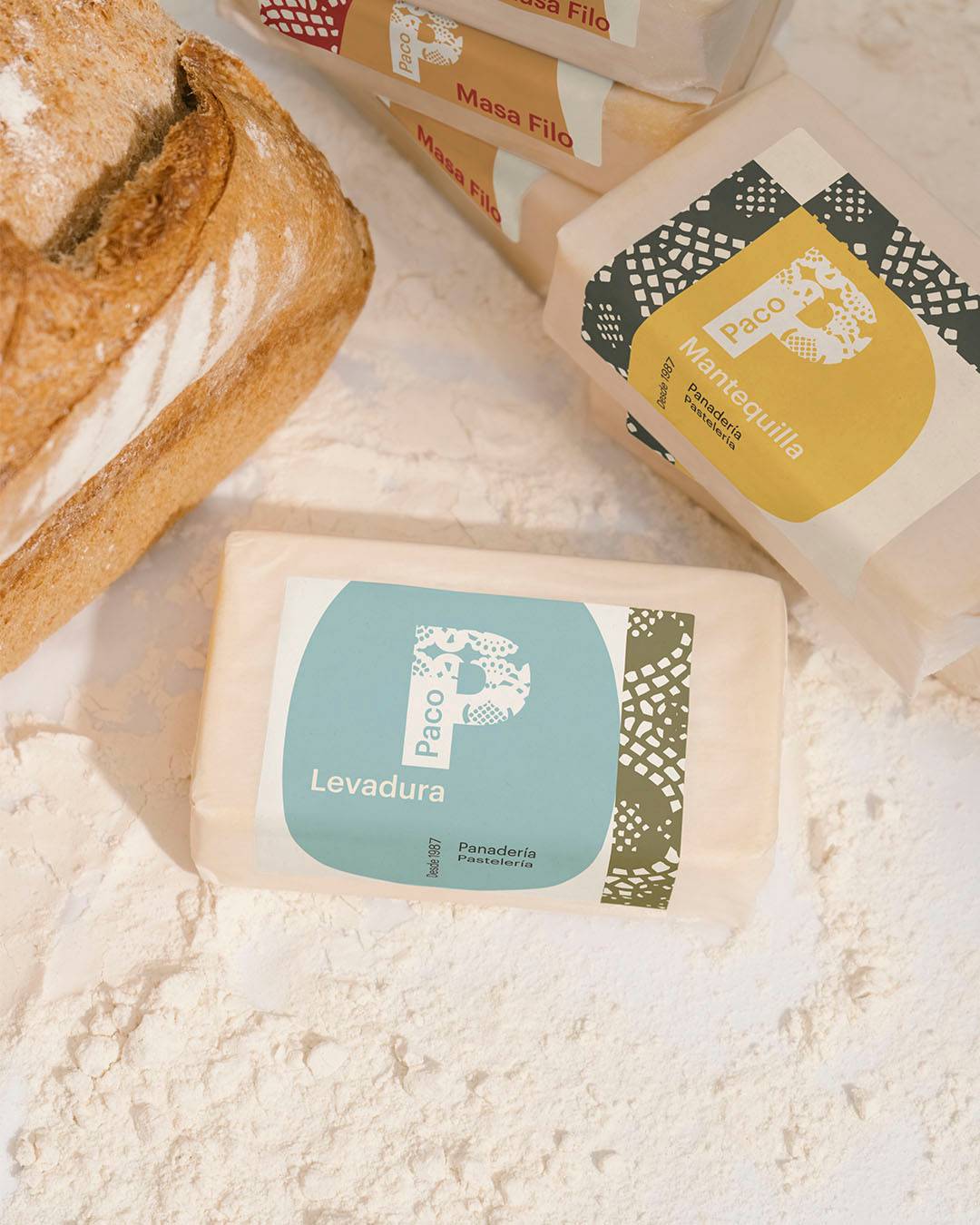
Colour acts as a stable, functional trait. Burgundy is set as the main tone, supported by a broad palette to distinguish categories.
Application The system carries over to uniforms, packaging and physical formats through clear composition rules.
The “P” remains the protagonist. Every other element orbits around its structural module.
The result is an identity that balances tradition and modernity, able to grow without losing coherence.
The result
A complete, recognisable and flexible visual system.