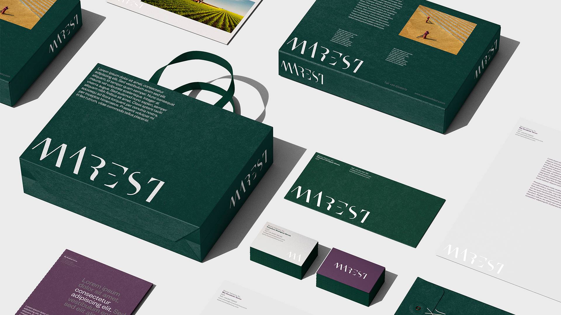
We built an identity for a firm working in strategic consultancy and investment. The brand starts from its own name —Mar, the Spanish for sea— and had to convey depth, solidity and sophistication without falling back on conventional financial codes. The goal was not to represent the sector. It was to build character.
The starting point was the name itself: Mar, the sea. The sea as a territory in constant transformation. A force that erodes, refines and leaves only what is essential. That idea of exploration, depth and progressive refinement connects directly with the logic of investment: analyse, intervene, transform. The identity draws on this tension between nature and rationality.
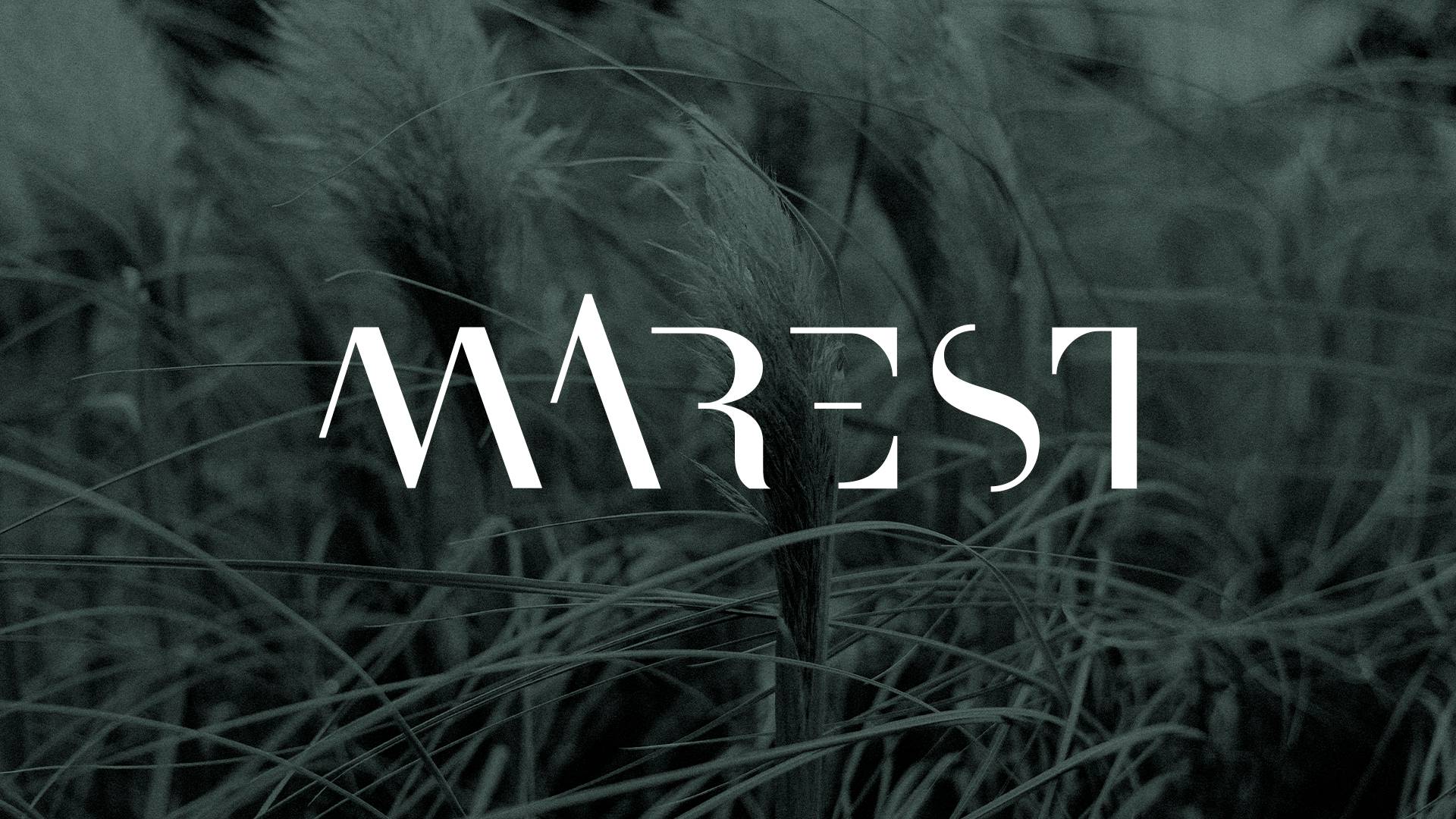
We began with a classic foundation: LTC Bodoni 175 Pro. A rational, elegant, structural typeface. We applied cuts, sections and kerning adjustments to create a bespoke logo. The “M” becomes the defining trait. The cuts evoke the swell and the transforming action of the sea, read in an abstract, sophisticated way. The result is a restrained logo, with internal tension and formal balance.
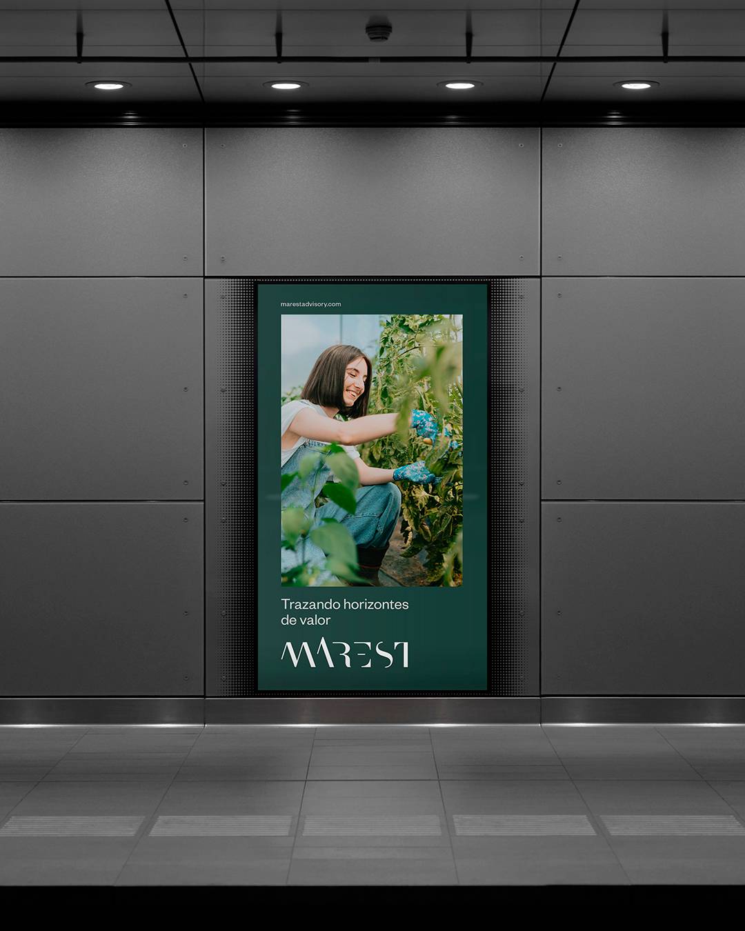
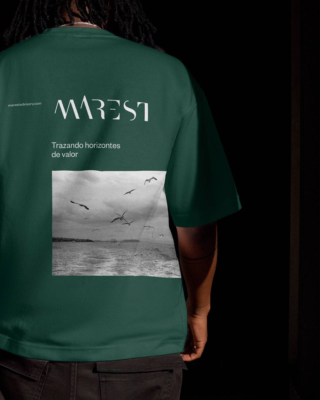
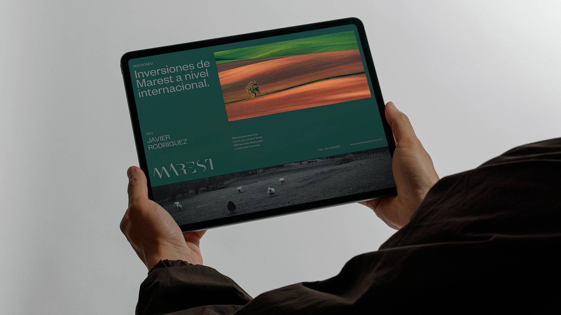
The palette is built on deep greens and purples. Dark colours that convey serenity, breadth and solidity. The system comes to life on heavyweight stock, textured grey paper and embossed finishes. The white logo, debossed or embossed, reinforces the sense of precision and refinement . Colour and material act as an extension of the concept: depth, control and trust.
The identity is structured through clear proportions and defined clear space. The logo can sit alongside variants or work as a combined mark, keeping formal coherence. Applications such as the corporate stationery carry that structural logic into physical detail, reinforcing the premium positioning.
An elegant, restrained and solid identity. MAREST presents itself as a sophisticated, trustworthy firm, where every formal decision answers to one idea: refine until only the essential remains. Design as synthesis.