Identity for a Family Office
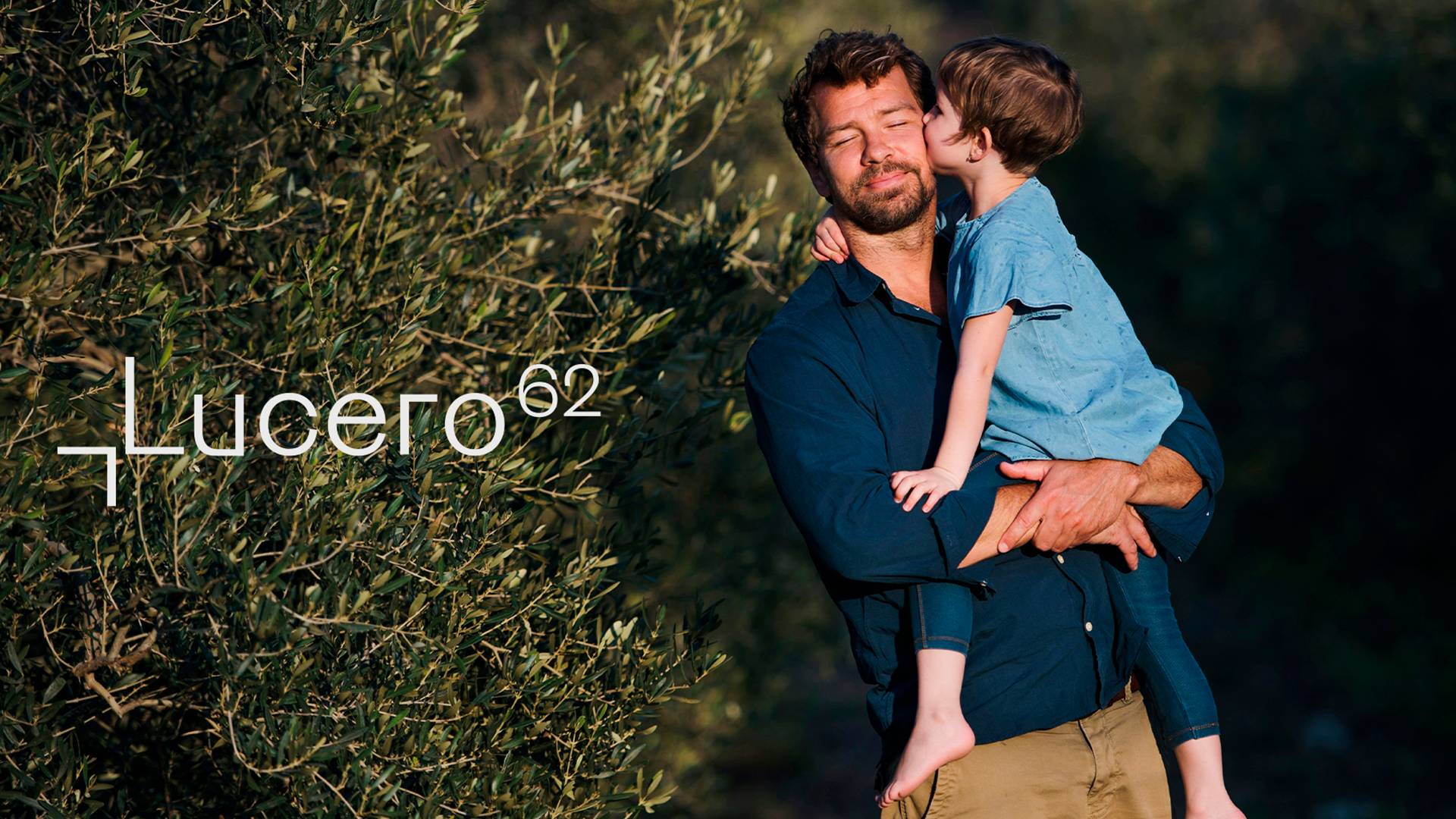
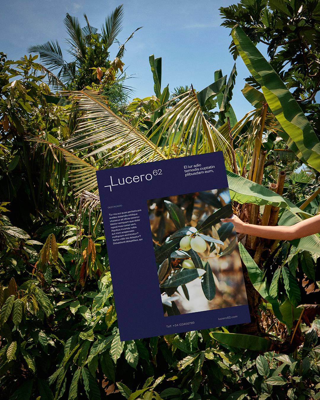
Lucero 62 is a family office dedicated to wealth management and strategic investment. The identity had to convey clarity, precision and discretion, moving away from the traditional visual codes of the financial sector.
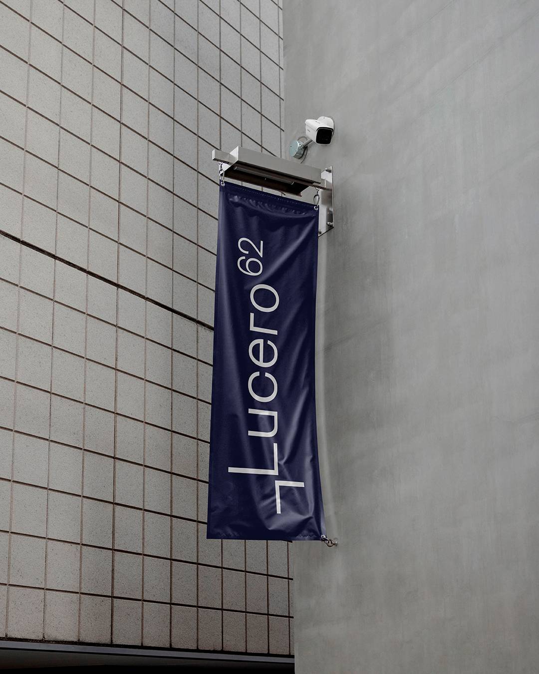
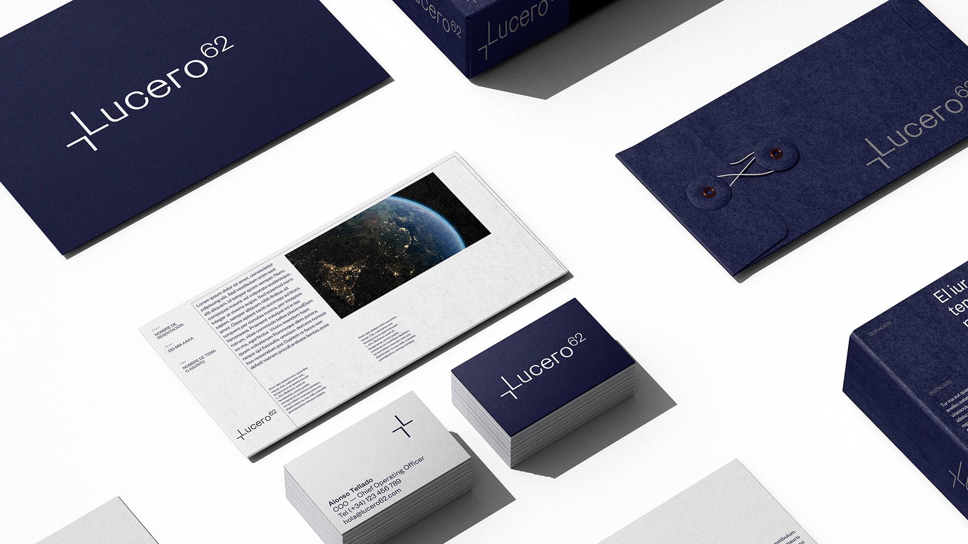
The proposal is built on a simple typographic gesture: two letter Ls that form a star where they meet. The symbol distils the idea of a lucero, the bright star that shines in the sky and serves as a point of orientation.
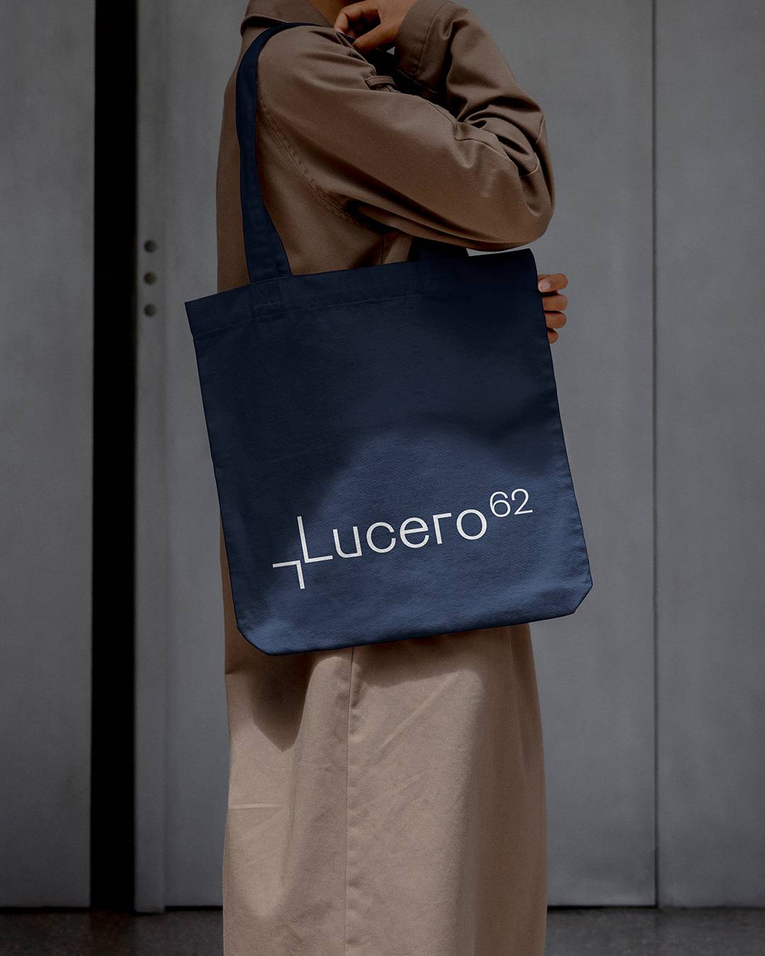
The result is a minimal, structural mark that works both as a logo and as a standalone symbol, enabling a restrained, flexible visual system.
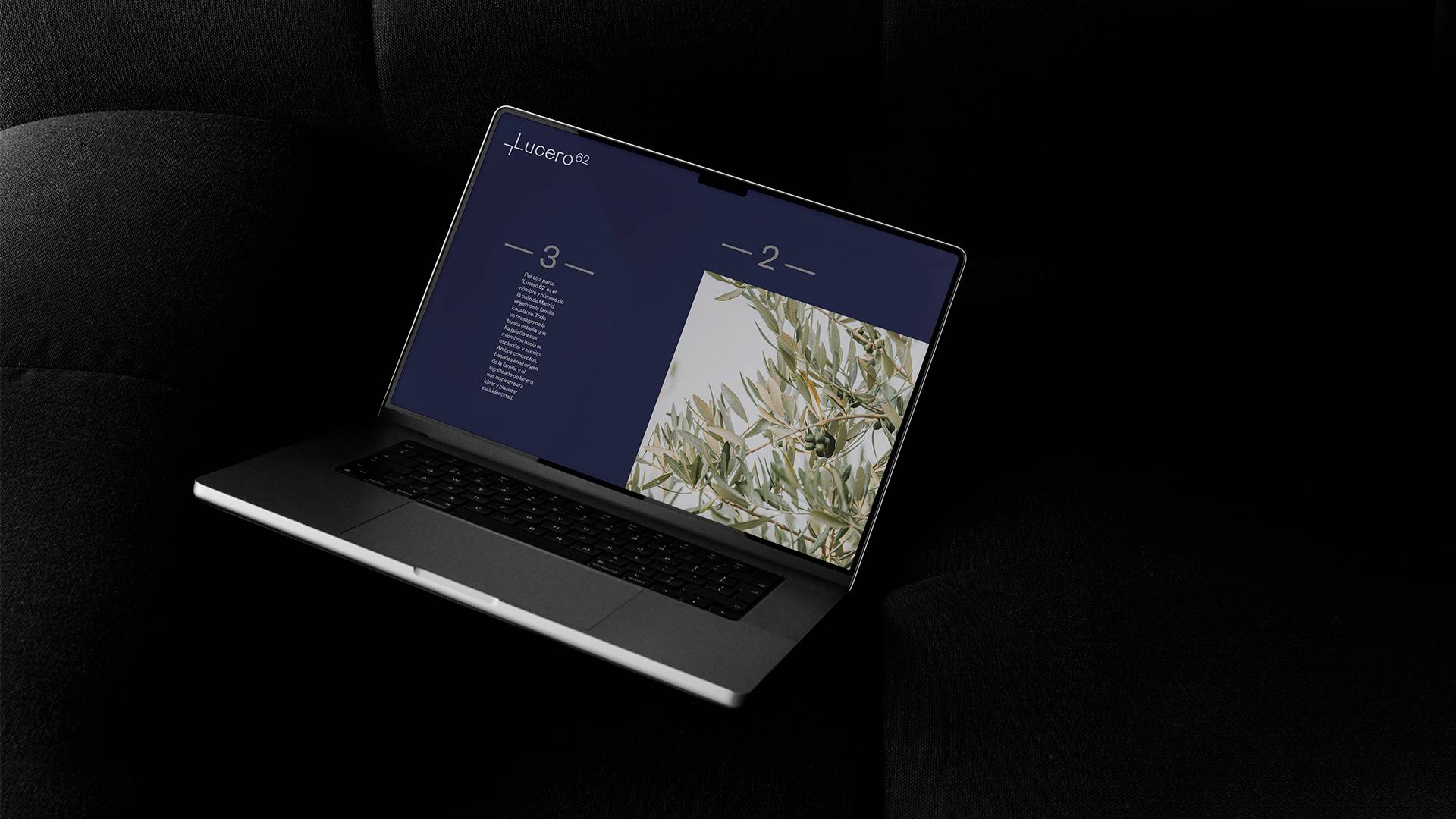
The identity rests on a clean typeface and a palette dominated by a deep blue close to the night sky, combined with greys and metallic finishes that reinforce the idea of brilliance and precision.
The whole comes through especially in materials and finishes — heavyweight papers, blind embossing and laminates — that bring presence and elegance without unnecessary gestures.