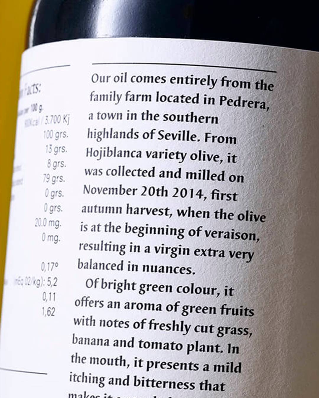
Ilípula olive oil comes from a family olive grove in Pedrera, a town in the highlands of southern Seville province. Pressed from Hojiblanca olives and milled during the autumn harvest, it is an exceptional oil with a fine balance of nuances.
Our brief was to create a high-quality product for the olive oil market, making its identity, packaging and design the cornerstone of its marketing and communication strategy.
We played with the idea of nature, and with the fact that this olive oil is organic and environmentally friendly. From its conception and throughout production, it is made with full respect for nature and for the olive tree itself.
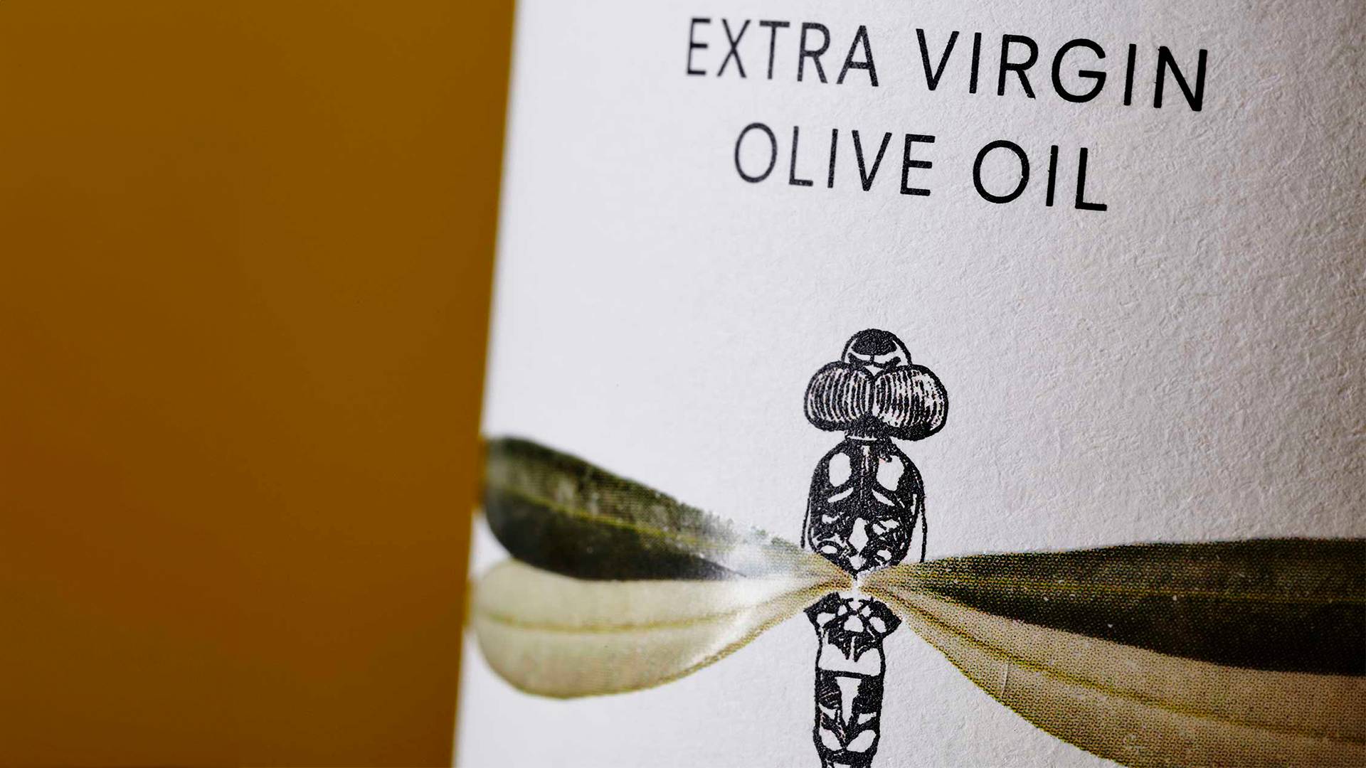
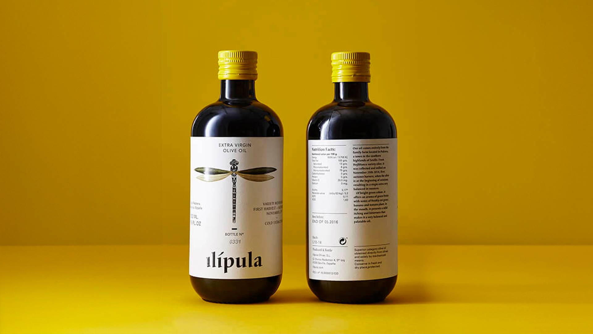
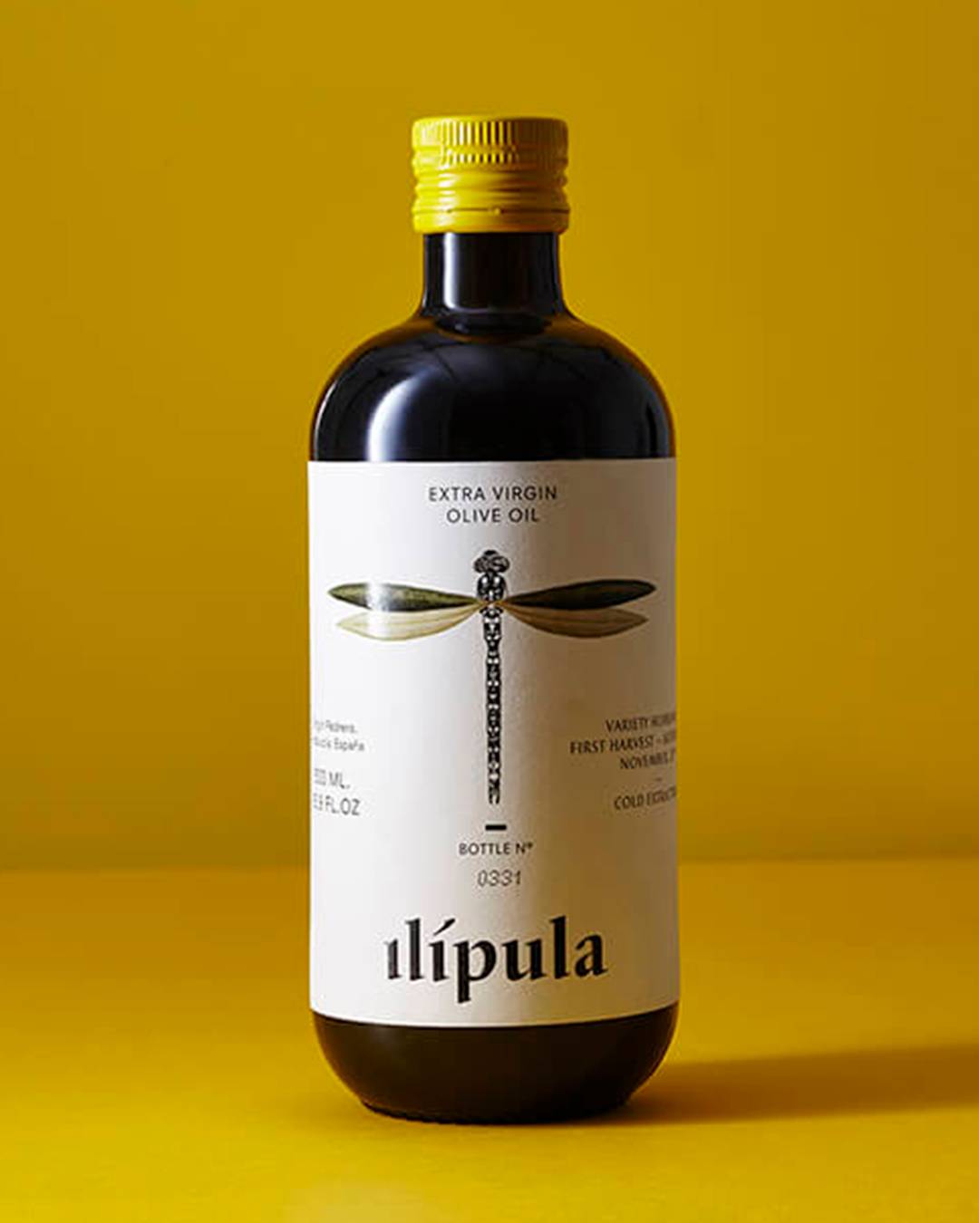
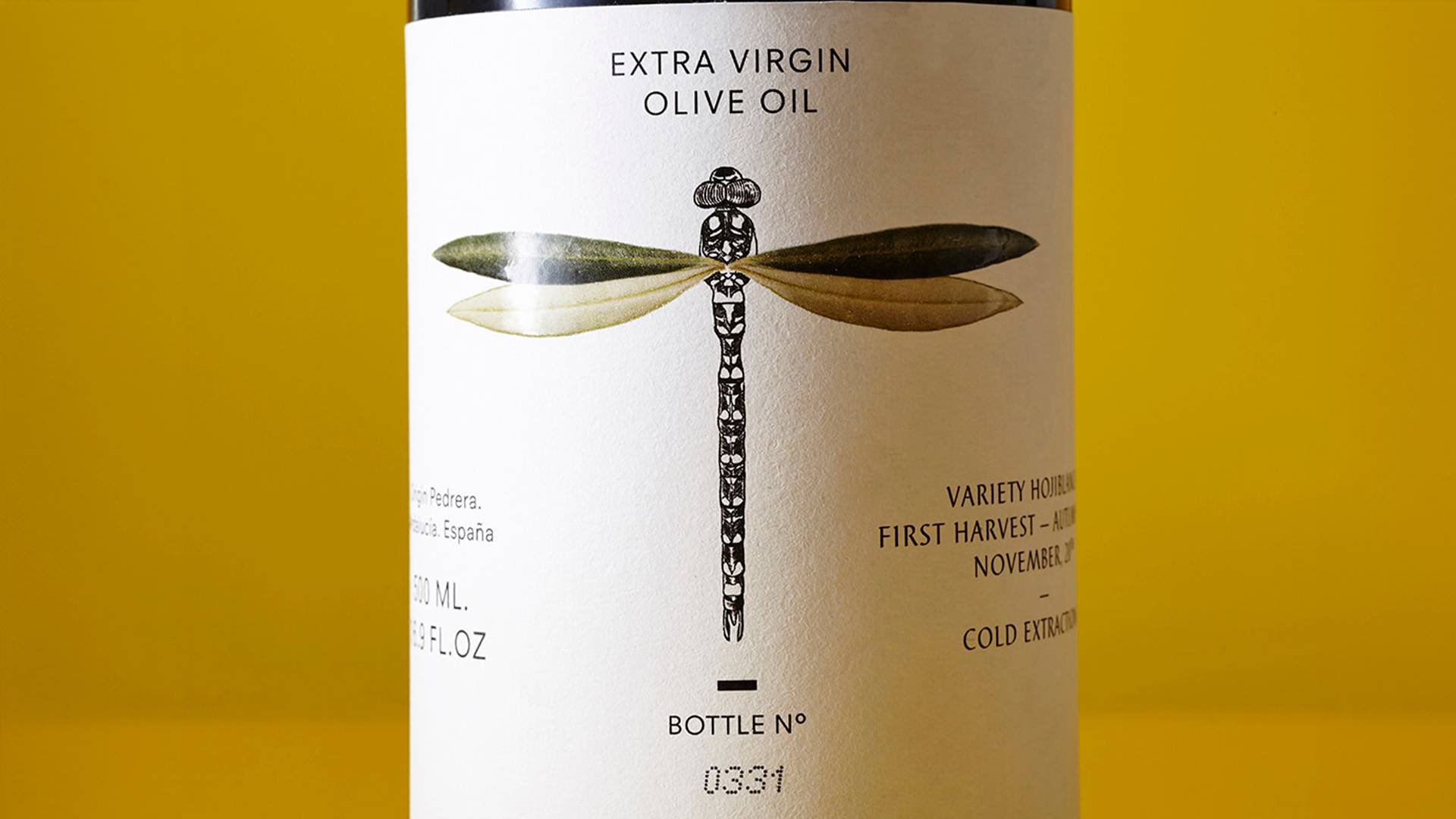
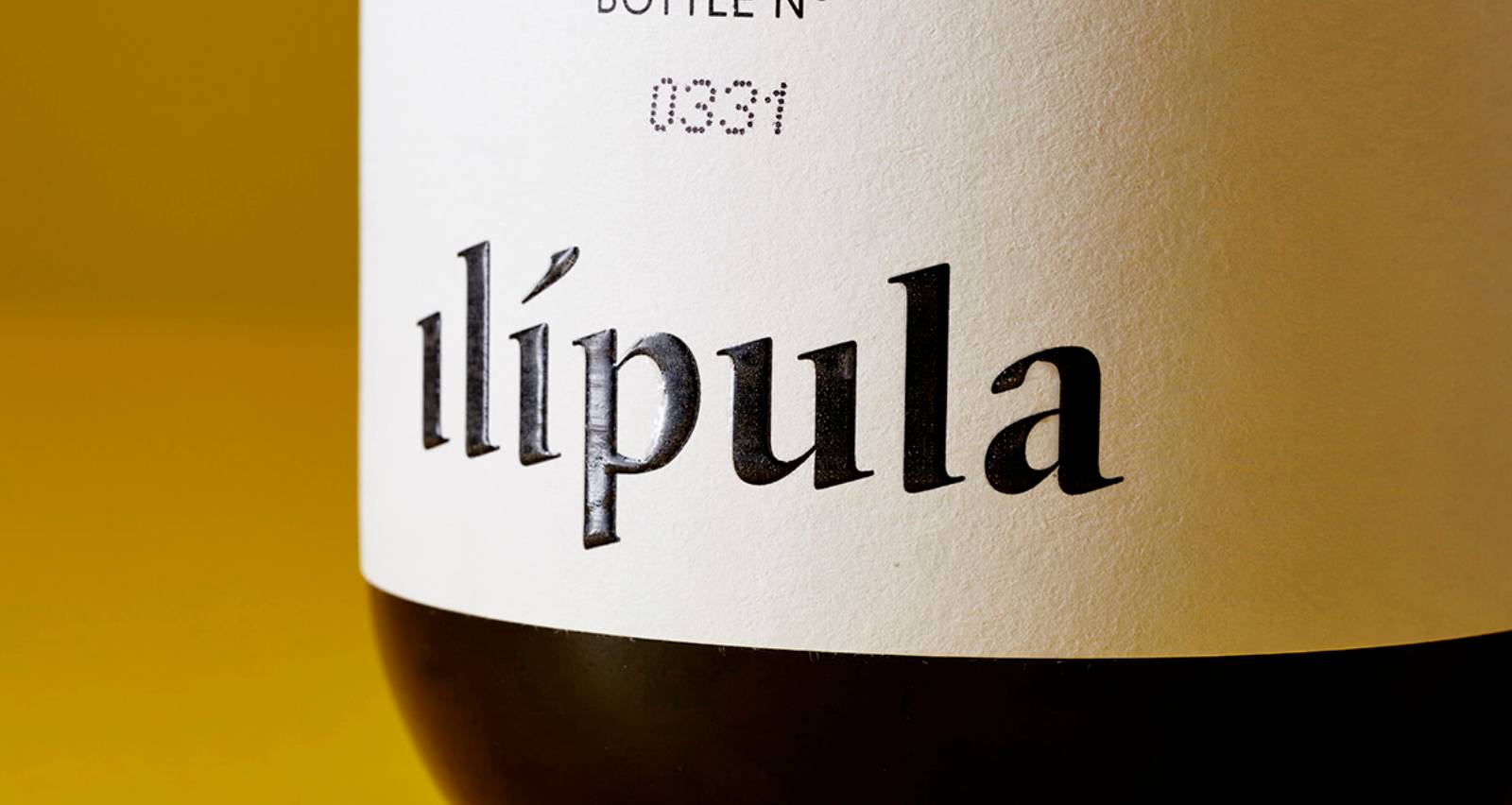
So we created an image based on the illustration of a dragonfly whose wings are formed from the leaves of the ‘hojiblanca’ olive variety. For the typography we chose Barbedor, which reminded us of old apothecary jars, just as the bottle we selected evoked potions and syrups. We chose off-white and yellow tones that recall the golden hour, at dawn and dusk, when the light is soft.
Ilípula's packaging takes us to a purer rural setting that has not lost its connection with nature and Mother Earth, one that respects and renews key elements of our culture, such as the consumption of extra virgin olive oil.
We designed a simple label with a carefully considered composition, as the starting point of a premium, distinctive consumer experience. Each bottle is numbered to tell the consumer this is not a mass-produced product: every bottle has been treated with the same care that Ilípula devotes to its olive trees and its customers.