Creating a new skincare brand from scratch. The project had to be born with a clear, contemporary and flexible identity, able to grow across products and routines without losing consistency or sensitivity. The challenge was not only aesthetic but structural: to build a system, not an isolated object.
HOLISI is an invented name, derived from the idea of holistic. Short, resonant and without a fixed meaning, it is designed to take shape through use and through the visual system. A name that does not explain, but accompanies. Open, flexible and ready to evolve with the brand.
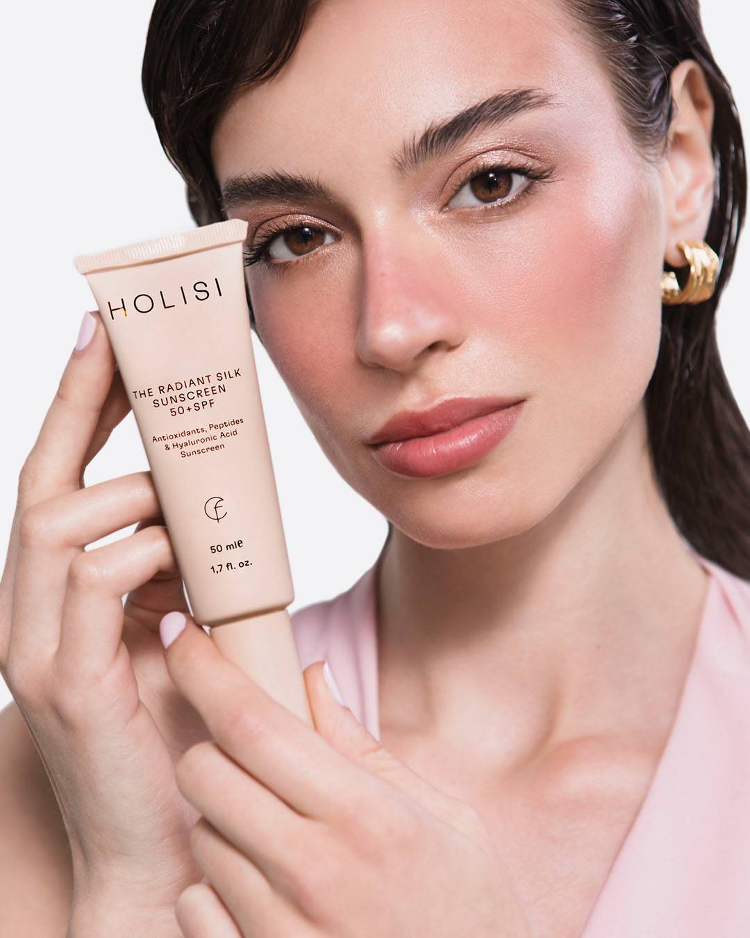
Visual Identity The identity is built on restraint. Clean typography, ordered composition and a constant brand presence as the backbone of the system. HOLISI behaves as a structural element: rhythm, repetition and balance. An identity that seeks consistency and permanence rather than attention.
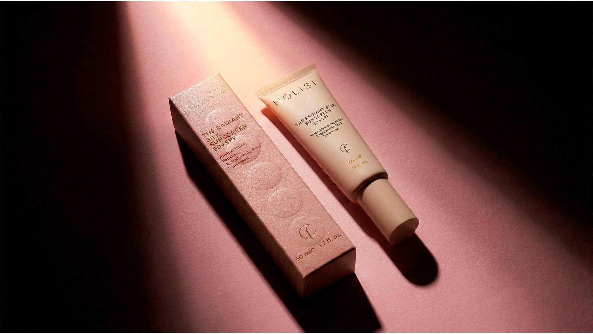
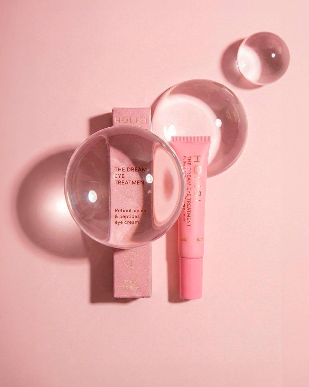
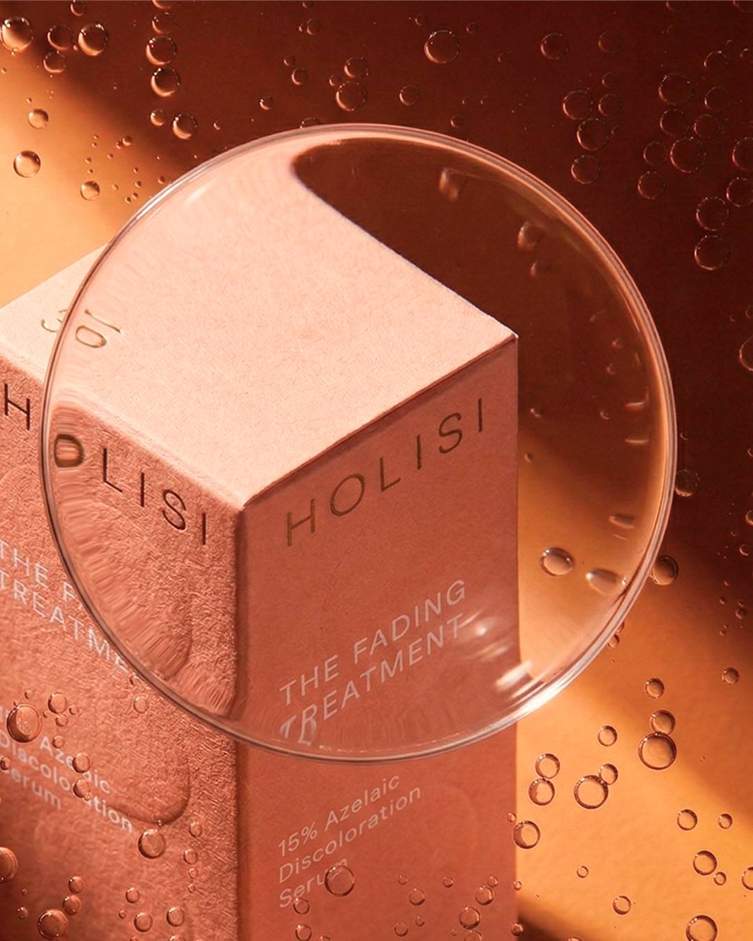
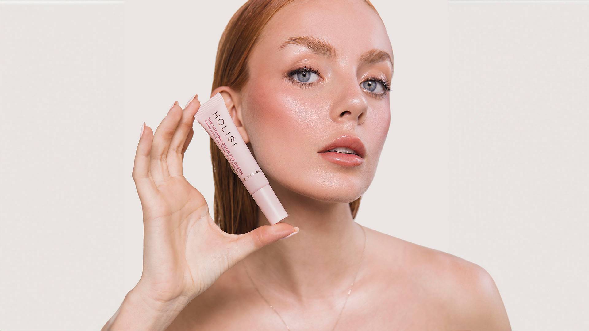
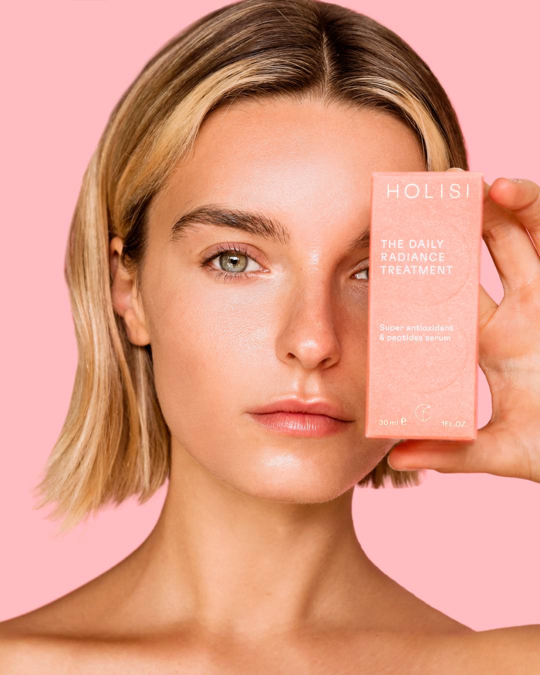
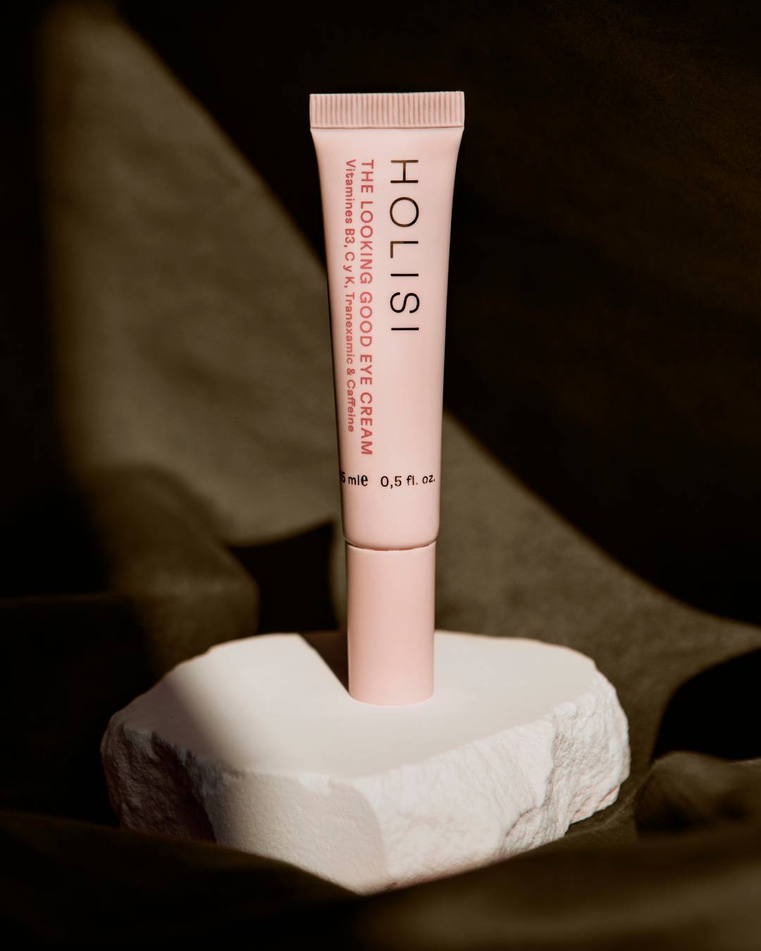
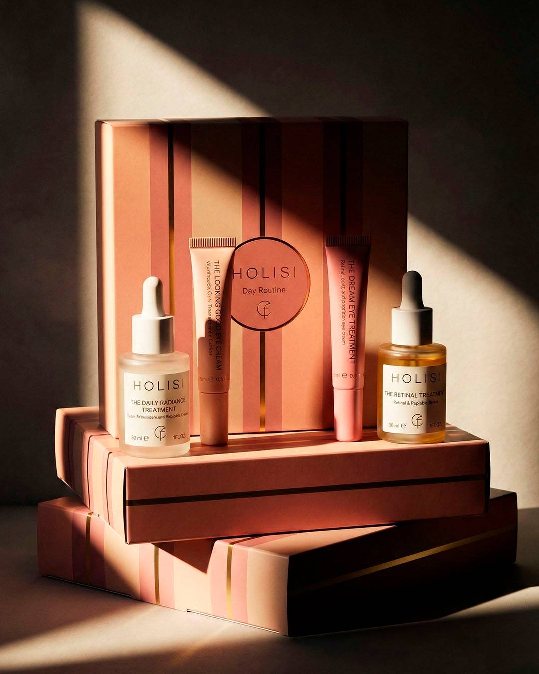
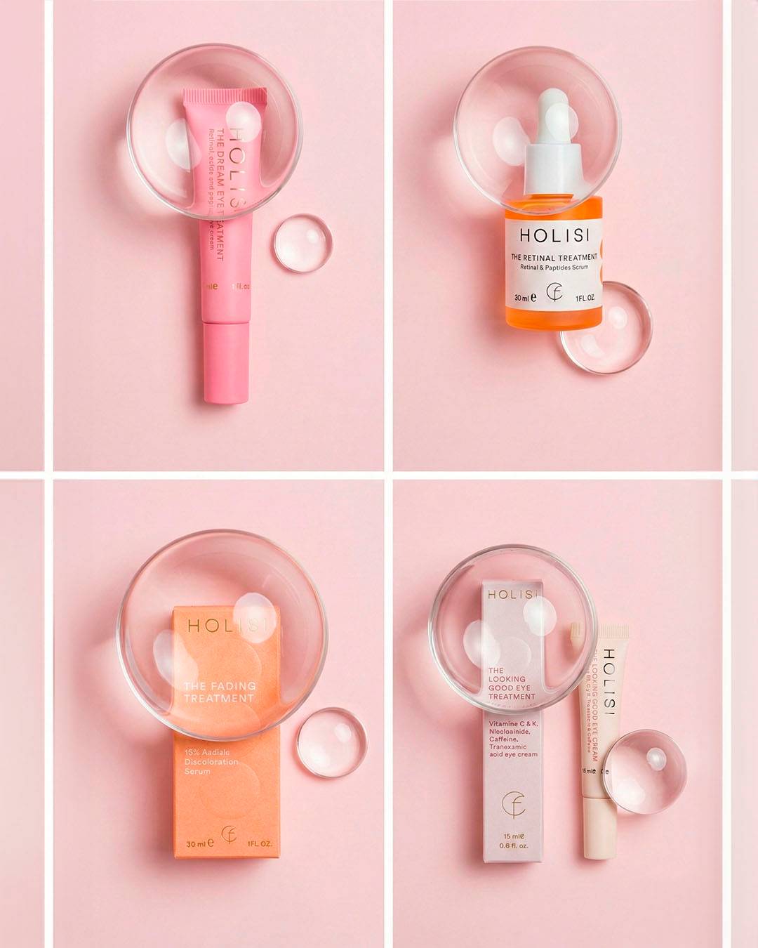
Packaging System Packaging is conceived as the core of the project. A serialised, clear and tactile system in which every element follows the same compositional logic.
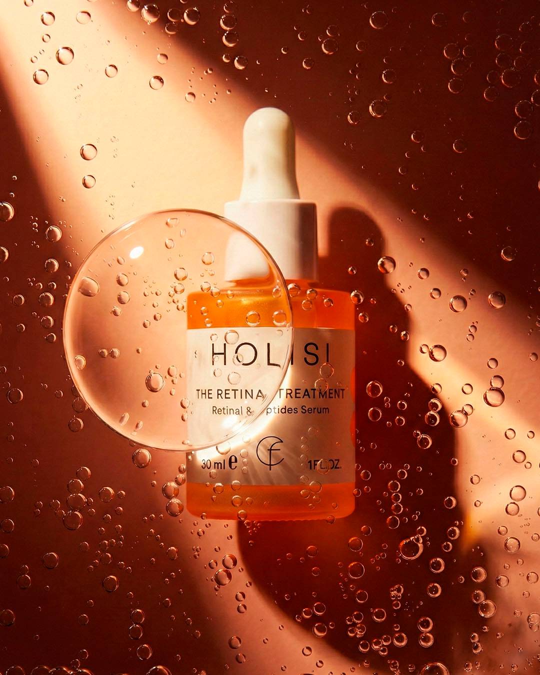
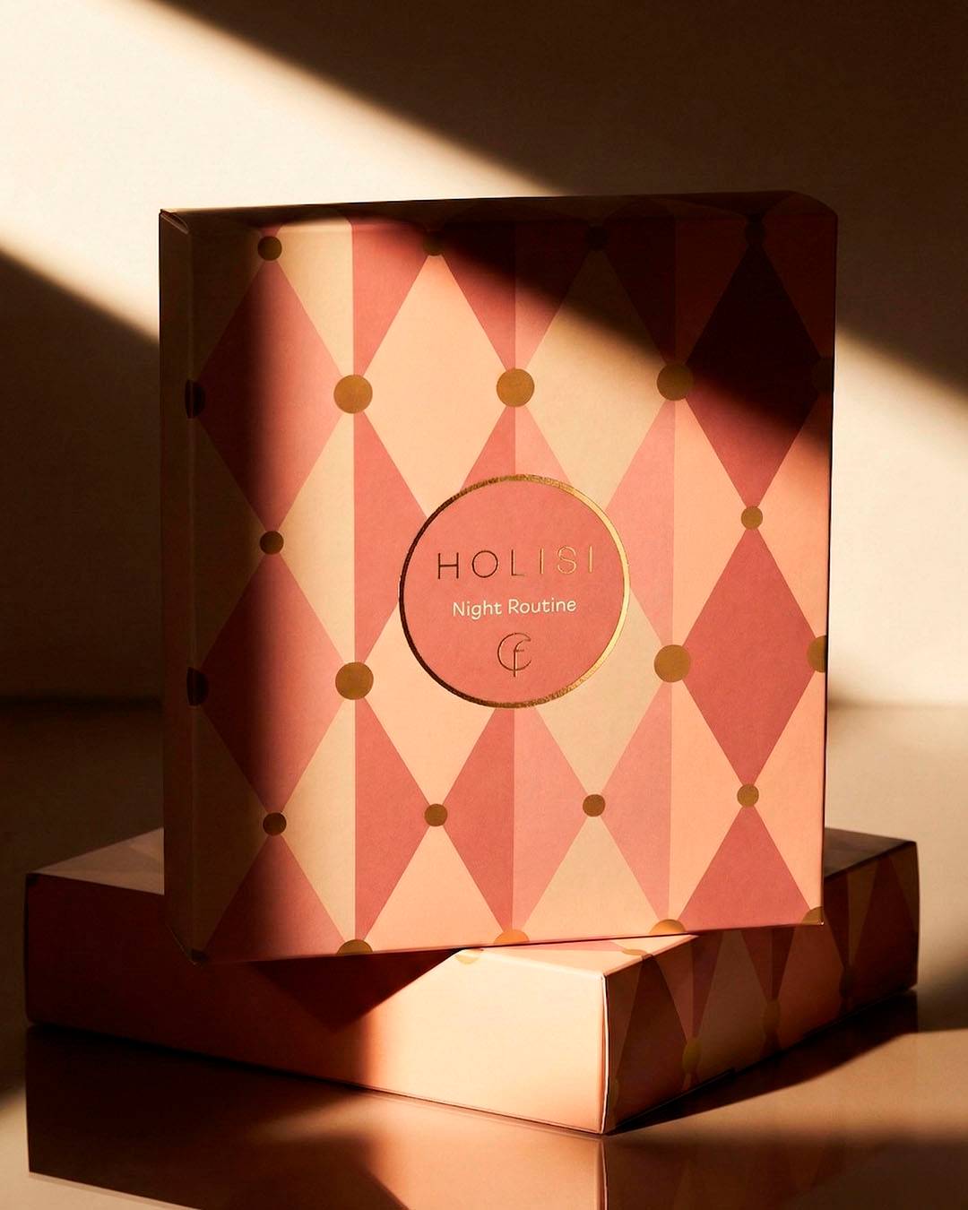
A single base concept is developed: Holism and matter, inspired by the idea of wholeness and the sum of parts. From the “O” in HOLISI and circular geometry, gradient patterns are built to add rhythm, volume and depth.
Pastel colour reinforces a sense of calm and care, while blind embossing introduces a tactile dimension that turns the pack into a physical experience.
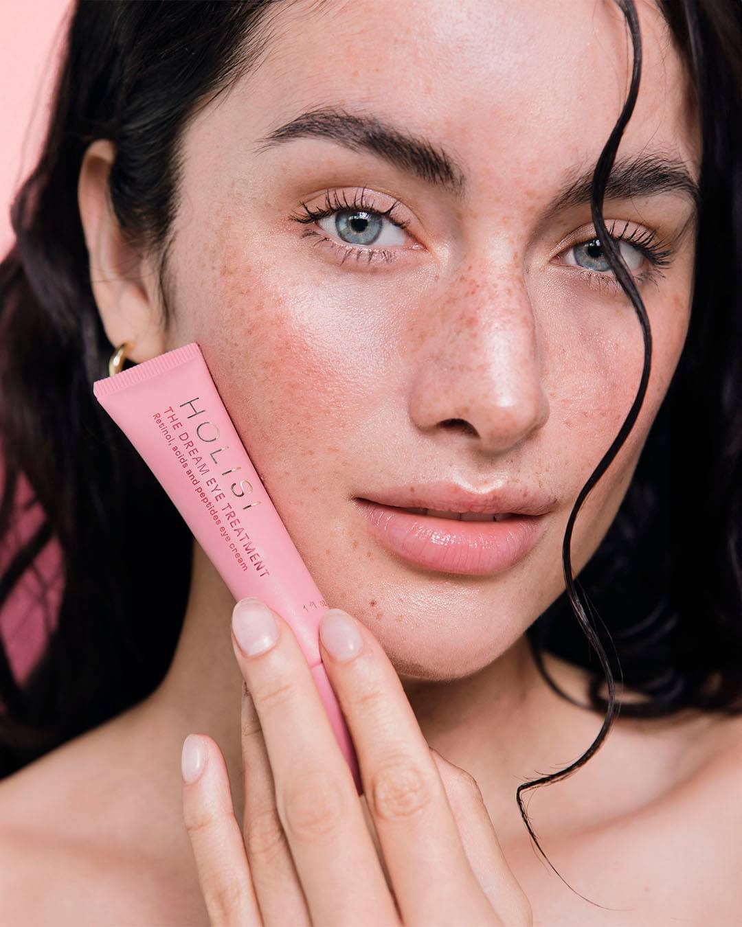
Each product is distinguished through variations in pattern and colour, within a shared structure that keeps the whole range consistent.
Result
A solid, sensitive brand system ready to grow. Naming, identity and packaging work as a coherent whole, where form, colour and material serve a single idea. Restrained design, with intent. A brand that is seen, touched and built over time.