ANTES. project for E. Moreno: strategy, identity, packaging and illustration (2013). Branding and strategic design studio in Seville.
E. Moreno
E. Moreno, a confectioner from Estepa with more than sixty years making polvorones and mantecados, wanted to launch a top-quality product under its El Obrador de los Ángeles brand.
The challenge: a traditional, seasonal sweet that does not photograph well, on a shelf where every box looks alike. How could it reach the national and international gourmet market and sell beyond Christmas?
We studied traditional Andalusian confectionery (shoppers, buying and eating habits) and international trends in confectionery, chocolates and biscuits: smaller boxes, new ingredients, a renewed value for craft, giftable formats and less seasonality.
Four decisions followed: contemporary craft, gourmet positioning, a shelf life of at least nine months and a strong identity to make up for a product that is hard to tell apart at a glance.
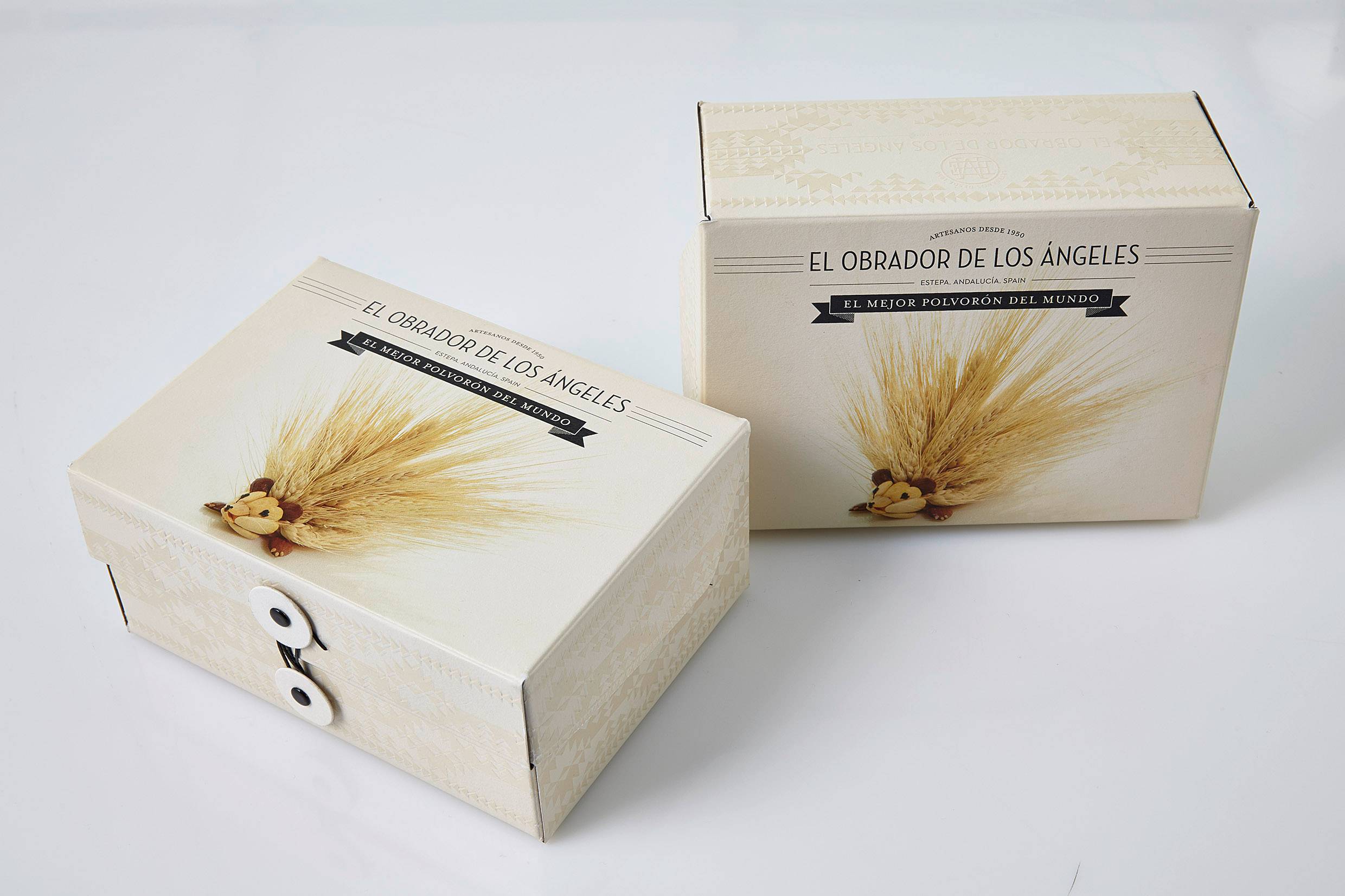
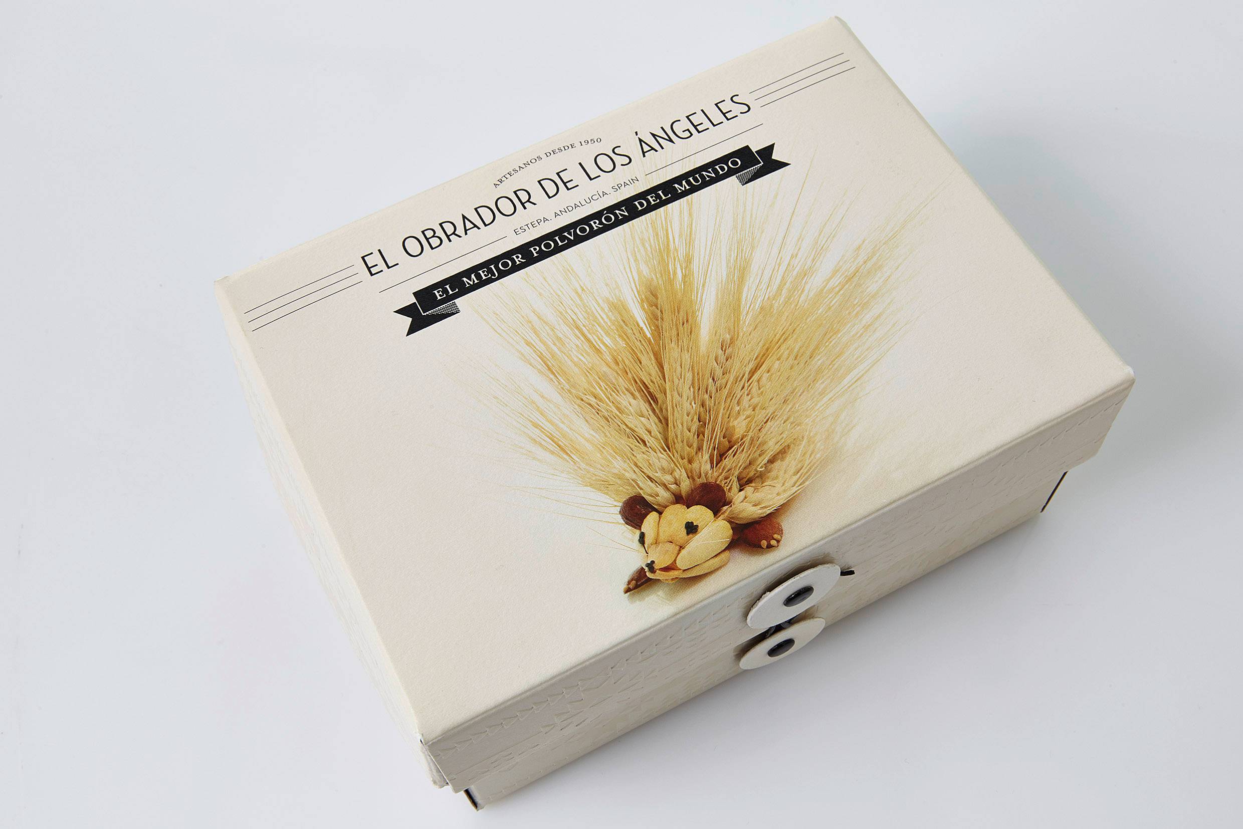
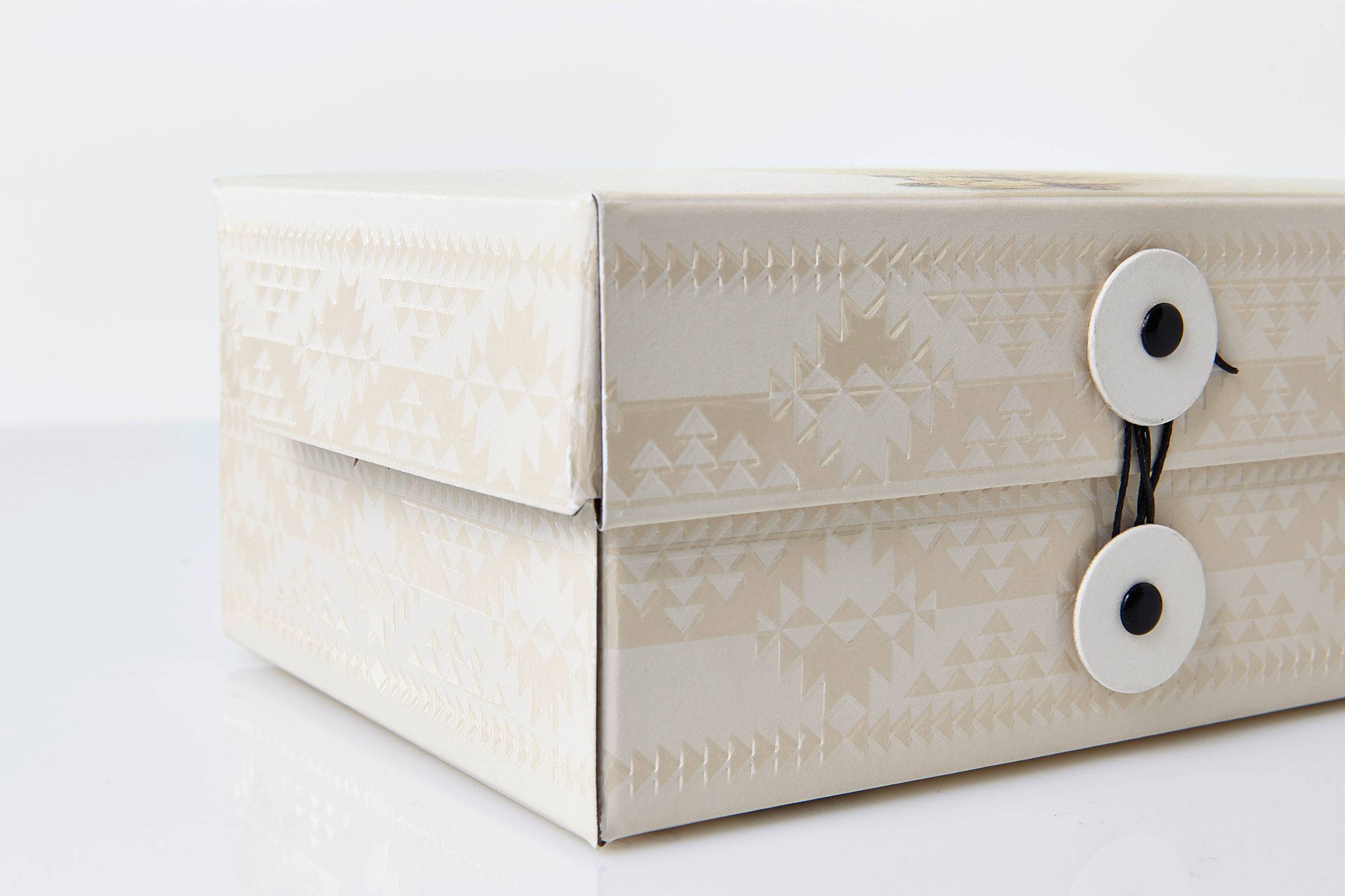
We designed a logotype built around the idea of «artesanos», with a refreshed classic typeface and the house's traditional border, simplified. The ornament draws on the geometry of Mozarabic tiles and mosaics, which also echo the flavours.
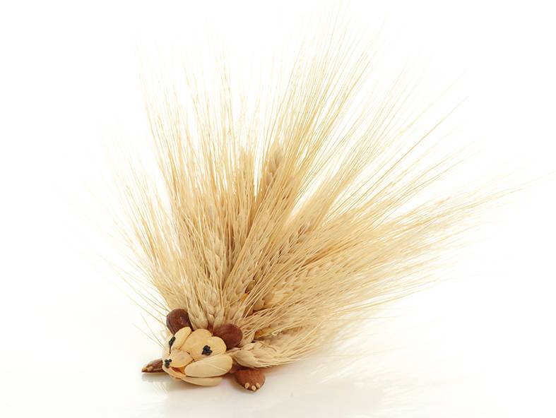
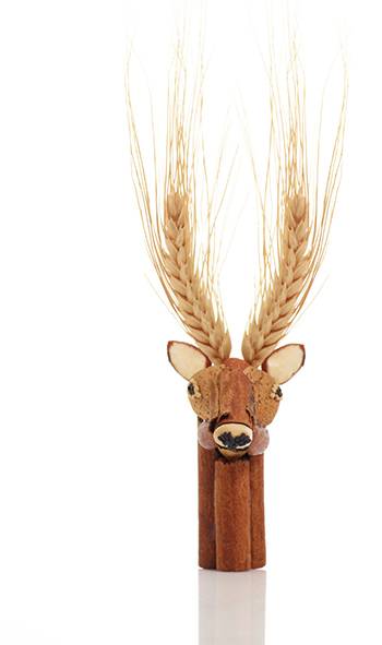
Each mantecado comes in a Japanese washi-paper flow wrap that brings it into the gourmet code. And the box presents the ingredients —candeal flour, Marcona almonds, retinto lard, Ceylon cinnamon, spices— through the wildlife of the place where they are made, with an autumn-winter feel that helps break the seasonality.
The result is a complete gourmet confectionery pack that turns a seasonal sweet into a year-round gift. A Buenos Días project (2013), now part of ANTES.